
Designing a personalization flow to reduce WhatsApp friction
Abraços In Box makes handmade gift boxes, baskets and kits, and every sale used to start with a long WhatsApp conversation about what could be customized. I designed a step-by-step personalization flow, with an optional preview, so customers decide what they want before they write. Around 80% of the customers who buy now use it, and the chat that follows starts from a complete order instead of an empty message.
In 30 seconds
Problem
Customers had to ask on WhatsApp what could be customized, what it would look like and how much it cost, and the business answered the same questions by hand.
What I did
Designed a step-by-step personalization flow with an optional preview, ending in a WhatsApp message that already carries the whole order.
Result
The site is live, but I do not have measured results yet. The next step is to instrument the flow, take a baseline and time the conversations.
Overview
Abraços In Box is a small business in São Paulo that makes gift boxes, baskets and kits by hand, to order. My mother started it in 2020, and my parents still run production and customer service. Sales came through Instagram and WhatsApp. The site lets customers browse, personalize, optionally preview, and finish on WhatsApp, where the business confirms the details. I was responsible for the digital experience: how choices are presented, what the site asks and when, and what arrives on WhatsApp.
Problem
To buy a personalized gift, you first had to ask
Before the flow, the site showed products but not what could be changed. Customers wrote on WhatsApp to ask what was customizable, what the gift would look like, how much it cost and whether it could arrive on their date. Every conversation started from zero: customers waited to decide, and the business retyped the same explanations.
- Options were invisible: customers could not tell what was customizable.
- The result was hard to picture: each gift is assembled by hand, and a catalog photo does not show your version.
- Every answer was typed by hand: prices, availability and delivery, in each chat.
The design question: how might we help customers personalize a gift with confidence before they write on WhatsApp, and spare the business the repeated explanations?
In my words, what customers kept telling us: “I don’t want to ask everything on WhatsApp before deciding. I want to understand what I can customize and arrive with something already close to what I want.”
Challenge
WhatsApp was the right place to close the sale, and the wrong place to explore it
I mapped the questions that kept coming back. Most had fixed answers, and only a few needed a person. The fixed answers belonged in the interface. The conversation, which customers trusted, stays for the rest.
Fixed answers belong in the interface
What can be customized, what is included, how much it costs, where we deliver.
Judgment stays with a person
A special request, a swapped item, a delivery that has to be arranged.
Process
What the site answers and what the chat keeps
The line I drew early, and the flow that follows from it.
The questions that kept coming back
I sorted the questions that kept coming back on WhatsApp by the kind of answer each needed. Most never changed from one customer to the next. That split became the line of the whole design.
Conversation analysis
Two kinds of question
Sorted by the answer each one needed.
- IN THE INTERFACEFixed answersWhat can be customized: the options of each productWhat is included: the items of the kitHow much it costs: price, payment, extras and freightWhere we deliver: the postcode and the delivery area
- WITH A PERSONJudgmentA special request: what the options do not coverA swapped item: a change to the kit, which becomes a quoteA delivery that has to be arranged
Each fixed answer, where the question comes up
Each fixed answer got a place in the flow, where the customer would otherwise have asked: options as fields on the packaging and balloon steps, the kit list on the product page, price and extras on the page, freight with the postcode.
Mobile-first UI
Four questions, answered on the screen
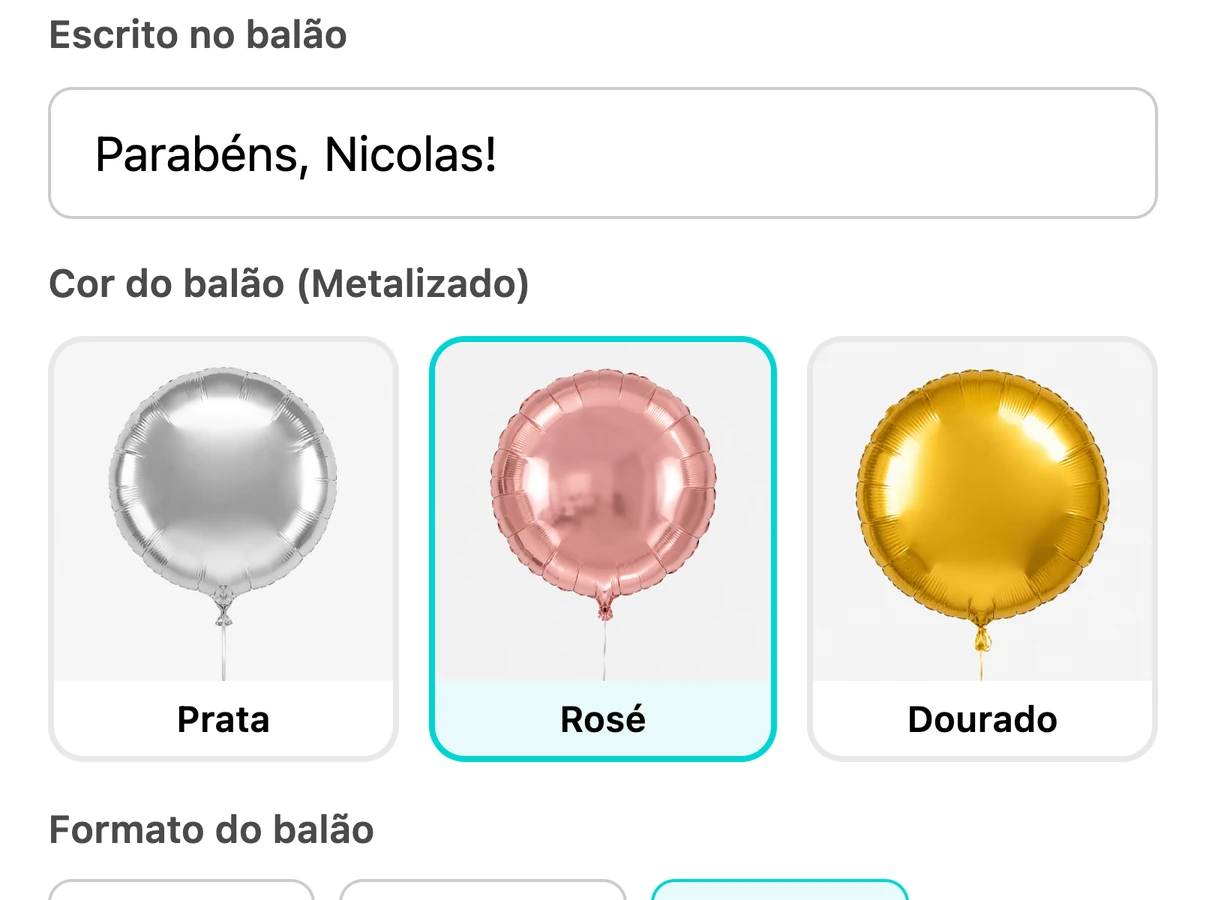 What can be customized: the fields of each step
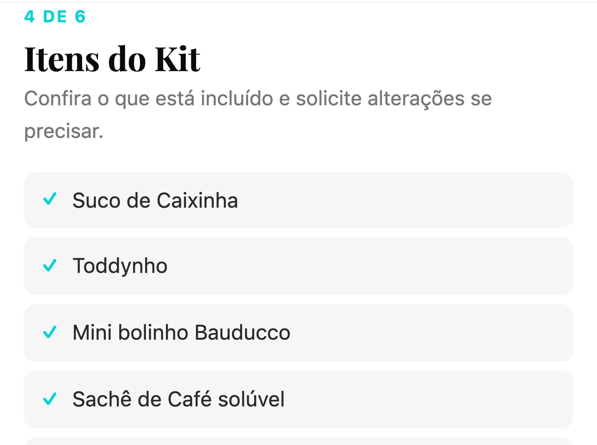 What is included: the list of the kit
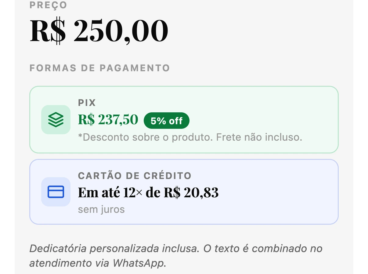 How much it costs: price, payment and extras
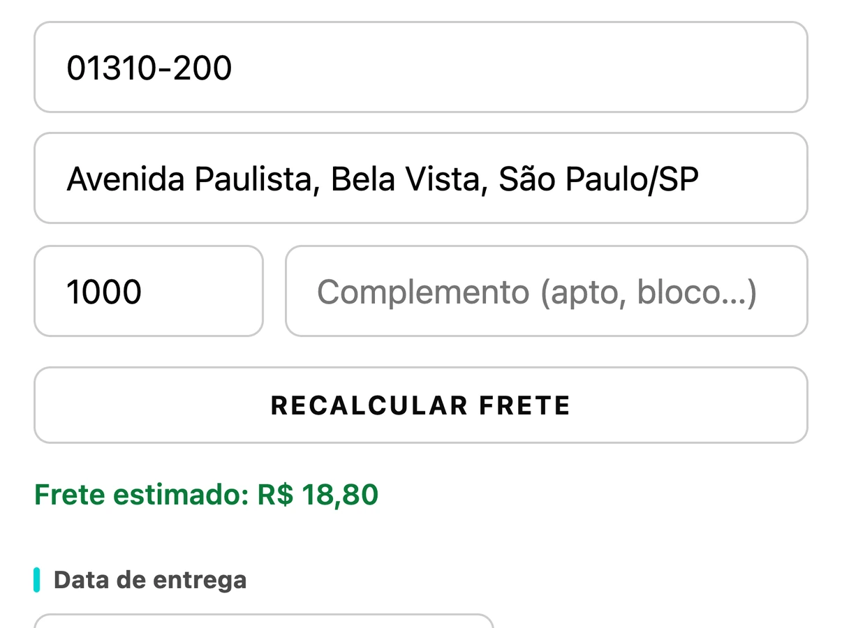 Where we deliver: postcode, freight and date
Only the steps that apply
The flow is built per product. The occasion is skipped for maternity gifts, framed pieces get one personalization step, the balloon step needs a balloon, and delivery is skipped when the address is known. Changing the kit is the only place an order becomes a quote.
Flow design
Six steps, fewer when they do not apply
Worked out for each product.
- 01OccasionSkipped for maternity gifts
- 02PackagingName on the box and ribbon colourFramed pieces: one personalization step
- 03BalloonText, colour and shapeOnly if the product has a balloon
- 04Kit itemsThe whole listA change request makes it a quote
- 05DeliveryPostcode, freight, date and periodSkipped if the address is already filled in
- 06SummaryPayment and contactThe order leaves with everything chosen
Key decisions
Six decisions behind the flow
Production is by hand and to order, there was no development budget, and WhatsApp was already the channel customers trusted.
Decision 1
Personalize first, talk second
The choices move to the product page, before the chat, so the first WhatsApp message already holds a decision. I did not build a full checkout: for handmade gifts the conversation still confirms details, so the site feeds it instead of replacing it.
Decision 2
One question at a time, only the ones that apply
Up to six steps (occasion, packaging, balloon, kit items, delivery, summary), assembled per product, with a progress count. It opens with the occasion: the easiest question, and it tells the business what the gift is for.
Decision 3
Leave room for exceptions
Handmade gifts vary, and a rigid configurator would block real requests. In the kit step, customers can ask to change an item. The order becomes a quote, the screen says the price will be confirmed on WhatsApp, and the conversation absorbs the exception.
Decision 4
Show the constraints before the customer is attached
Out-of-stock packaging does not appear. Shipping comes from the postcode, and the flow does not move on with an invalid code or an address outside the area. These limits used to come up in the chat, after the customer had picked something.
Decision 5
Preview before committing, and say what it is
Monte e Visualize reuses the same fields and generates an illustrative image, labeled as such, noting that the final assembly can vary. Limits per session and per day, and caching of repeated combinations, keep the cost predictable.
Decision 6
Make the handoff carry everything
The summary opens WhatsApp with the message written: product, choices, shipping, date, address and total. The same data is saved as an order, quote or preview lead. The business starts from a complete order, not an empty chat.
Solution
A short flow, built per product, that ends in a complete order message
A range you can browse, a step-by-step flow on each product page, an optional preview, a structured handoff to WhatsApp and a way out when nothing fits. The site does not replace the conversation: it starts it further along.
Solution 1
A range you can browse by category
The home page shows the categories as large round pictures, and a bar with all of them stays at the top of the catalog. Each opens its own range, and a second tab switches from baskets to framed pieces. Whoever is still deciding can look around; whoever knows goes straight there.
Solution 2
Step-by-step personalization
“Personalizing” opens a flow with a progress bar and one decision per screen, without the steps that do not apply. It was designed at mobile width first, because the main audience shops on phones.
Solution 3
Preview before ordering
A separate tab where customers choose a model, personalize it and generate an illustrative image. The preview has a shareable page and two next steps: order, or ask on WhatsApp. Orders that start here carry the link, so the business sees what the customer saw.
Solution 4
Price and delivery inside the flow
Shipping, delivery date and total appear in the flow instead of being negotiated afterwards. If the customer asks to change items, the order becomes a quote and says so.
Solution 5
A WhatsApp message that is already an order
The summary opens WhatsApp with the message prefilled. The same information is saved in the back office, tagged as order, quote or preview lead, so the business sees at a glance how each one started.
Solution 6
A way out when nothing fits
After eight products a floating button asks “Didn’t find what you wanted?”, and a search with no result shows a card saying the team can make it as the customer wishes. Both open a brief of eight short questions, one per screen, from occasion to contact, with a line in the customer’s own words. It ends in a confirmation that promises a WhatsApp contact, and the business is notified with the request organized and tagged.
Results
No measured results yet: how I will measure them
I would rather say that than invent numbers. This is what I expect to change and how I would find out, starting with a baseline.
Where the flow loses people
An event on each step shows how many customers reach the summary, and where they leave.
Whether the preview and the way out help
Count previews, how many become orders, and briefs from the floating button versus an empty search.
How long a conversation takes
Time a WhatsApp conversation from first message to confirmed order. A small sample by hand is enough.
Which questions still come
Tally what customers still ask, to see whether the fixed answers moved into the interface.
Reflection
A small business’s constraints are a design brief, not an obstacle. With no research team and no development budget, I worked from what the business already knew: the questions customers repeated and how my parents answered them. The most useful decision was a boundary: what belongs to the interface and what needs a person. The preview is illustrative and there are no measured results or formal usability tests yet, and I would rather say that than overstate it. I designed and built it myself, working in code with an AI assistant.
What I would improve next
- Set the baseline first. Write down today’s numbers (conversation length, repeated questions, orders started on WhatsApp) before changing anything else.
- Test with first-time customers on mobile. A few short sessions on step order, wording and the preview’s expectation.
- Reduce the manual work that remains. Item changes still become quotes by hand; I would look at a small set of priced swaps.
Other cases
All cases
Market research
Building a connected system for research knowledge
A centralized intelligence layer that connects every study and insight into one conversational source of truth.

Travel and tourism
Turning proposal workarounds into a voucher workflow
A dedicated voucher workflow that helps travel agents create, track and deliver trip information with clarity.