Turning proposal workarounds into a voucher workflow
Geni Travel is a microSaaS for travel agents. This project addressed a critical workflow gap where agents were using proposals to deliver itineraries and trip information because the platform lacked a dedicated voucher experience.
In 30 seconds
Problem
A strong tool for building travel proposals had no clear way to deliver the final trip information to clients.
What I did
Designed a dedicated voucher workflow, built on four product decisions, that turns a proposal into a clear, trackable delivery.
Result
Less friction in delivering trip information, better organization across proposals and vouchers, and a stronger base for the product to grow.
Overview
Geni Travel is a B2B platform for travel agents, used to plan trips and deliver them to clients. The work happened with no design system in place and little UX maturity in the team, so decisions about structure and patterns were part of the work.
Problem
A strong planning tool was doing the job of a delivery tool
Geni Travel offered strong tools for creating travel proposals, but lacked a clear way to deliver finalized trip information to clients.
- 82% of users used proposals to send itineraries and travel details.
- Information became harder to manage and reuse.
- The workflow created unnecessary friction for agents
There was a clear gap between planning trips and delivering them.
82% of users were using proposals as a workaround to deliver itineraries and travel details. “The proposal works well for selling the trip, but it gets messy when I need to use it to deliver the actual itinerary and travel information.”
Process
How the work got there
Research, personas, prioritization, sketches and iterations behind the decisions.
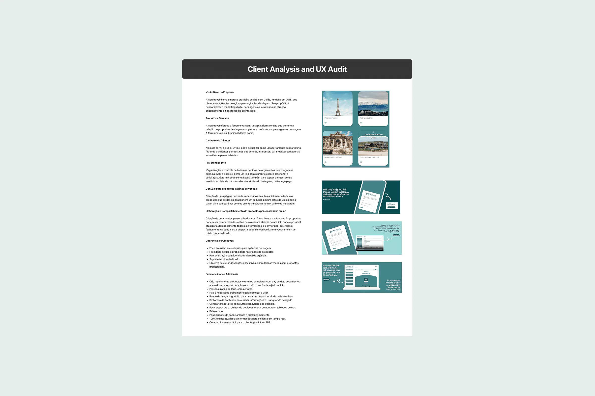
Product analysis
A heuristic evaluation of the platform found clarity and organization problems in the layout, and a dated look. The proposal flow was the most used feature; Genibio and client management saw little use.
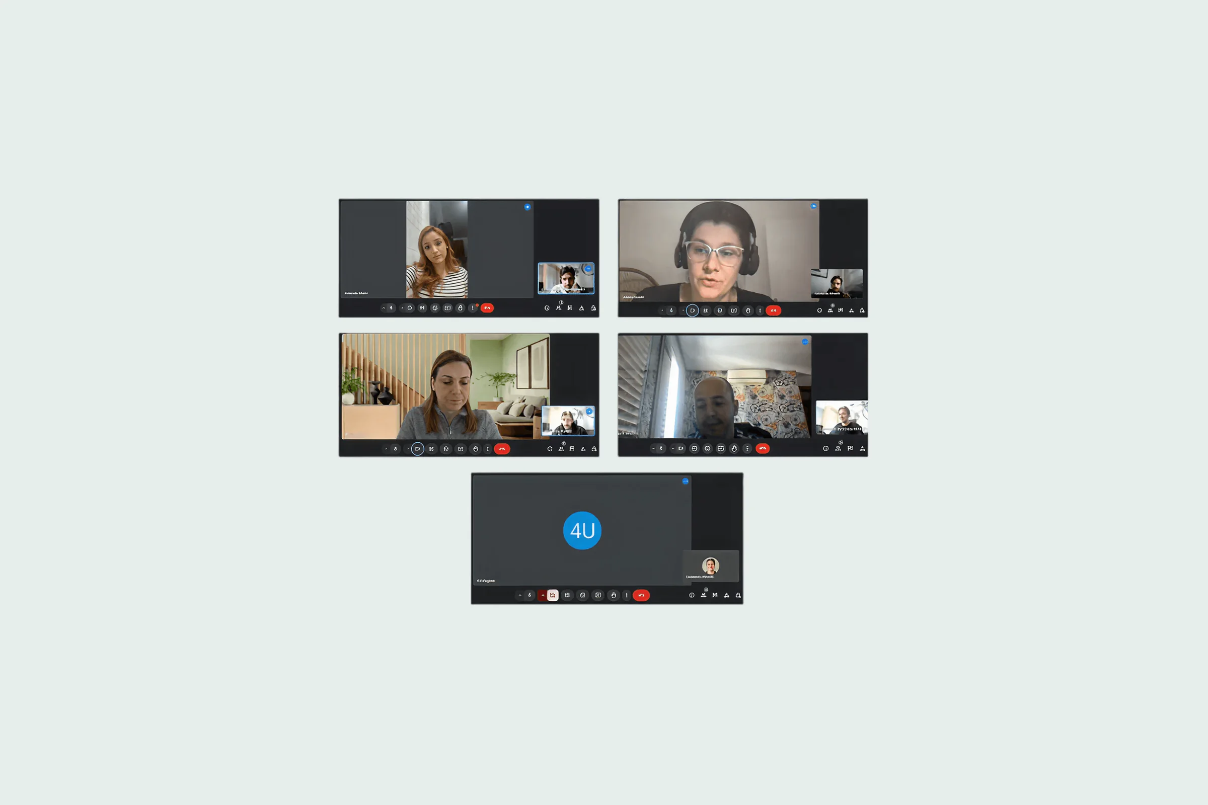
In-depth interviews
Five one-on-one conversations to understand pain points and expectations. Personalized vouchers came up as a missing feature, with agents improvising with proposals to deliver to clients. Client management felt unintuitive, and the image library was too small.
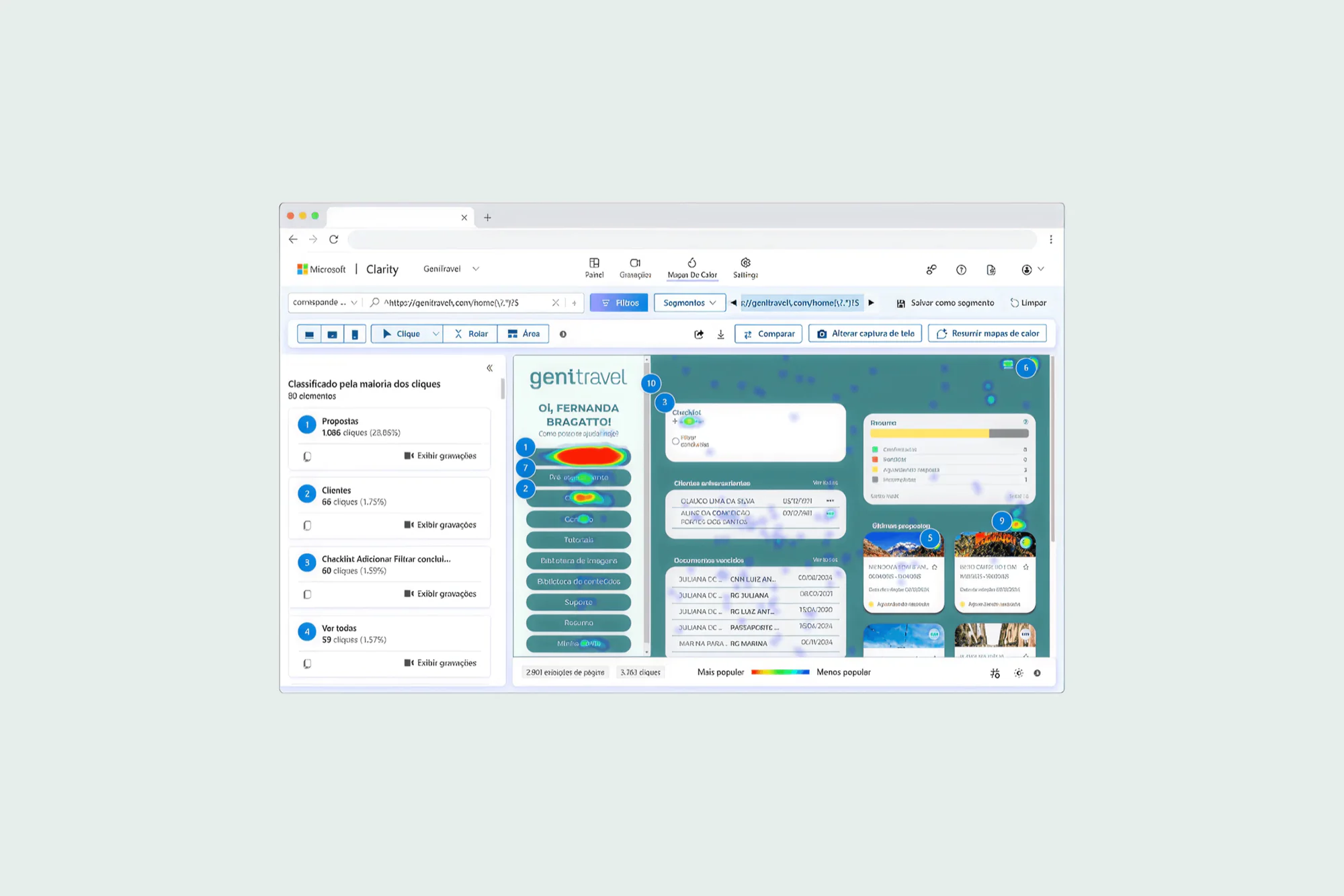
Microsoft Clarity
Heatmaps and session recordings to see real behavior. Most agents only used the proposal tools, and secondary features were barely touched, which suggests their value was not clear.
Stakeholder chat
A conversation with the CEO and the CTO to understand the platform's strategic goals and align expectations. Both asked for an updated layout, which matched the heuristic evaluation.
Survey
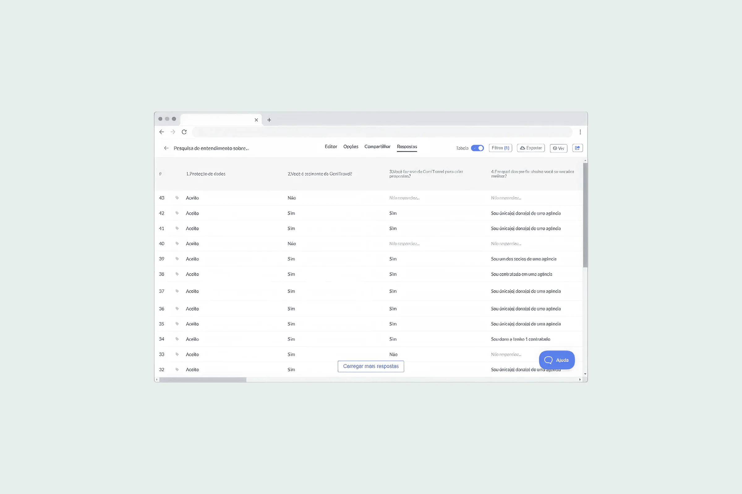
Run right after the interviews, which is unusual, but the team had low UX maturity and needed clear quantitative evidence. Over 50 users answered: 82% deliver itineraries as proposals, 71% update proposal status often, and many asked for an integrated voucher system.
Personas
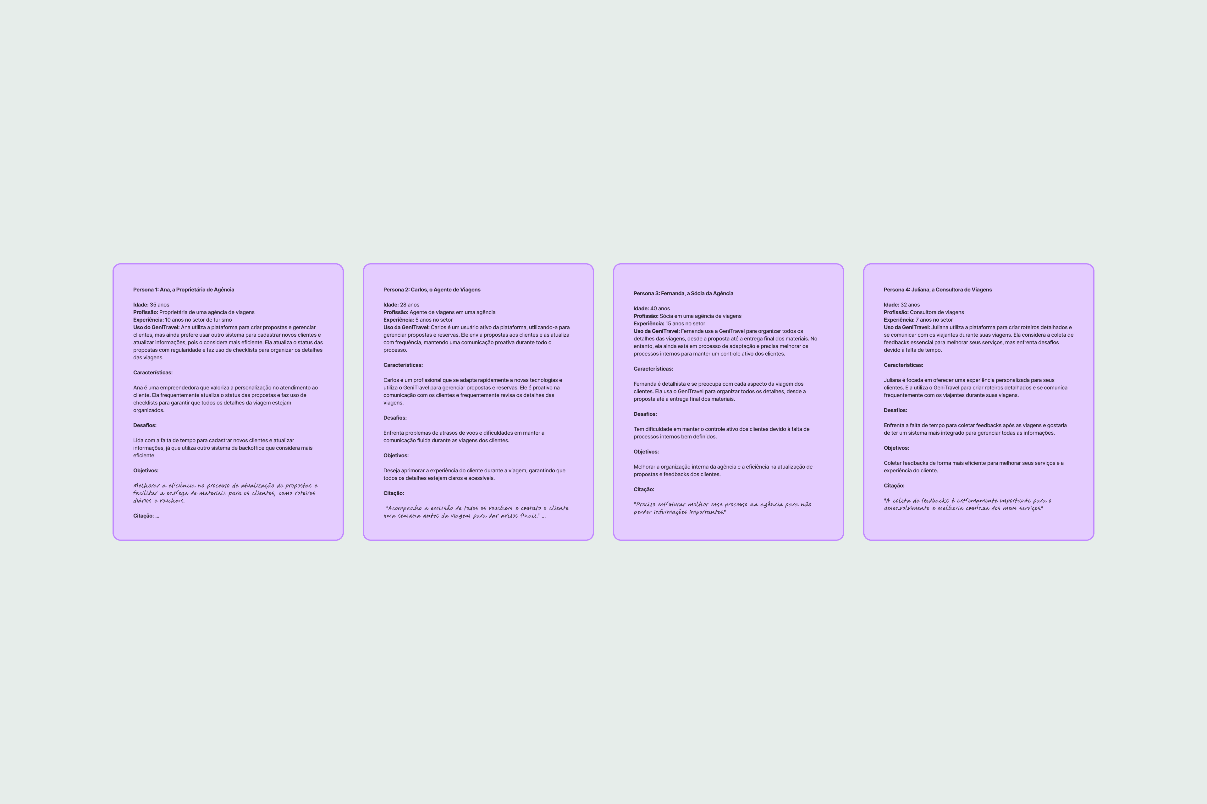
Built from the interviews and the survey to represent the most common profiles, and used as the base for the user flows.
How Might We
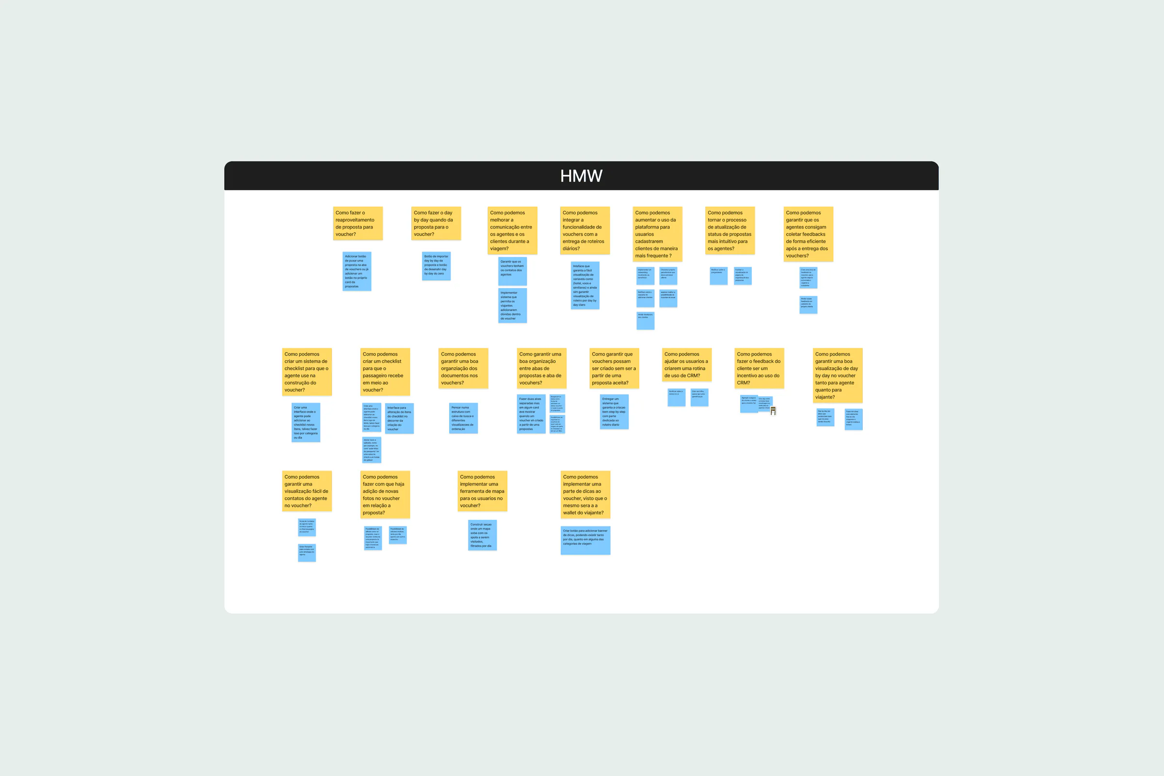
The HMW exercise raised the questions behind the project, for example: how might we reuse proposal data when creating a voucher, and let vouchers exist without an accepted proposal?
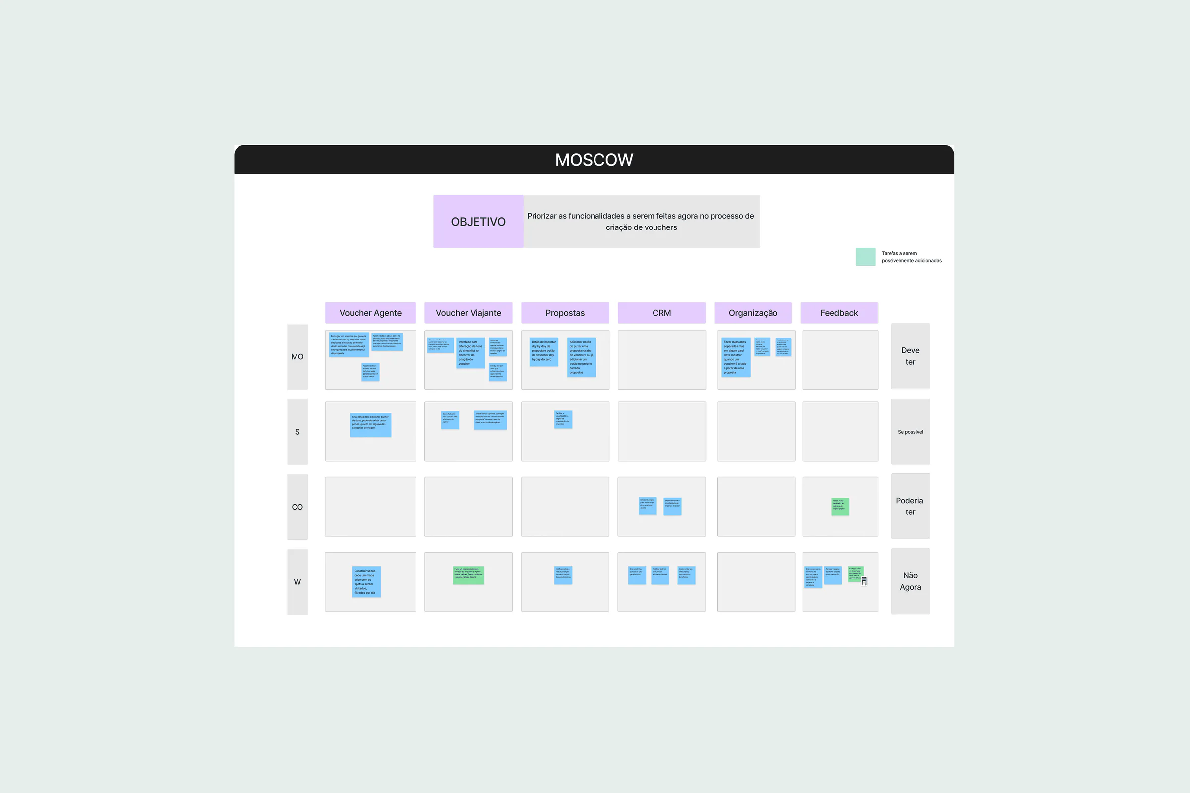
MoSCoW
Features prioritized for the voucher tool. Must have, among others: automatic data transfer from proposals, step-by-step creation with a day-by-day itinerary and a create-voucher shortcut on proposal cards. Should have: customizable banners. Could have: an agent checklist. Won't have for now: a traveler feedback area.
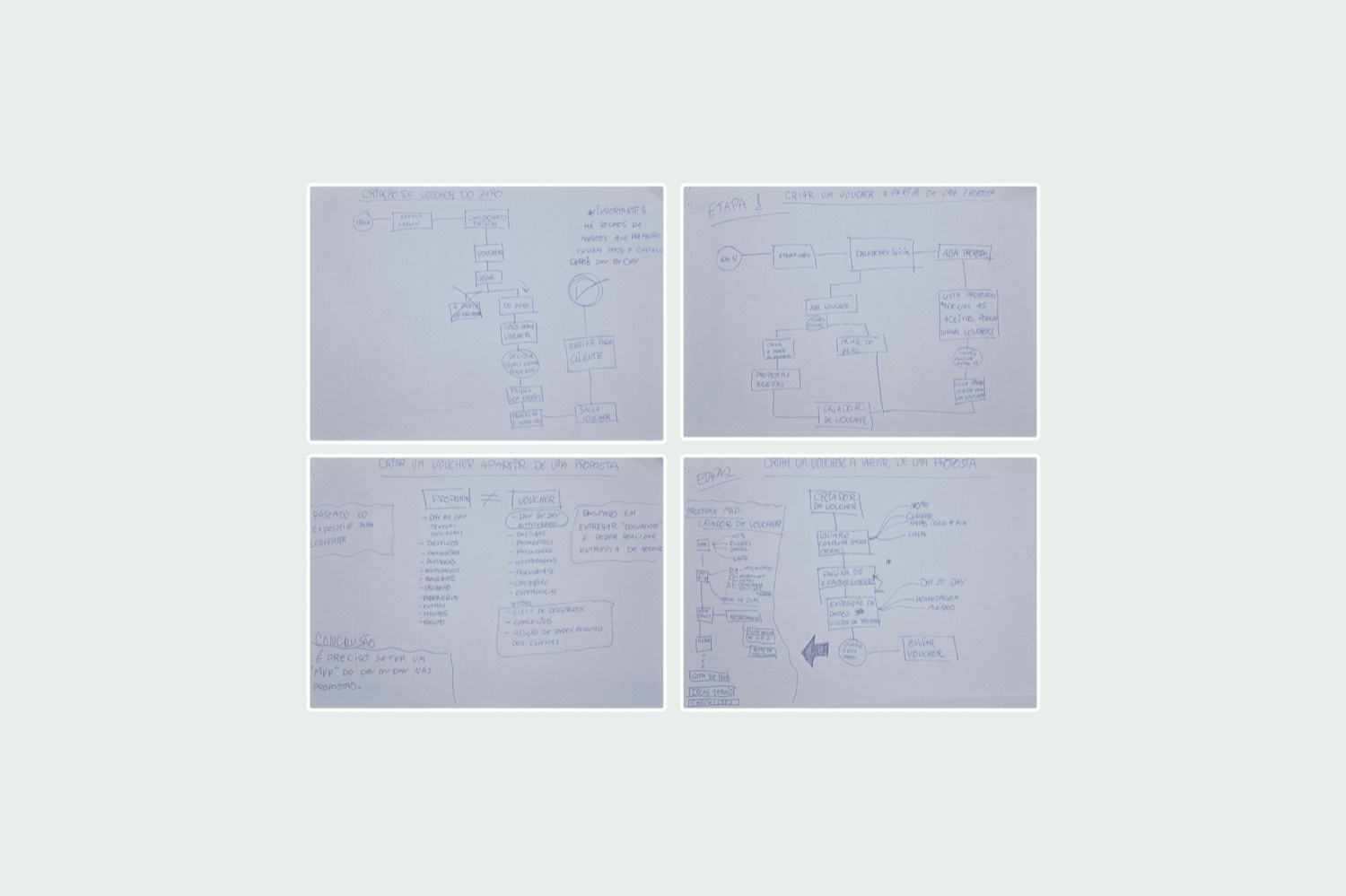
User flows
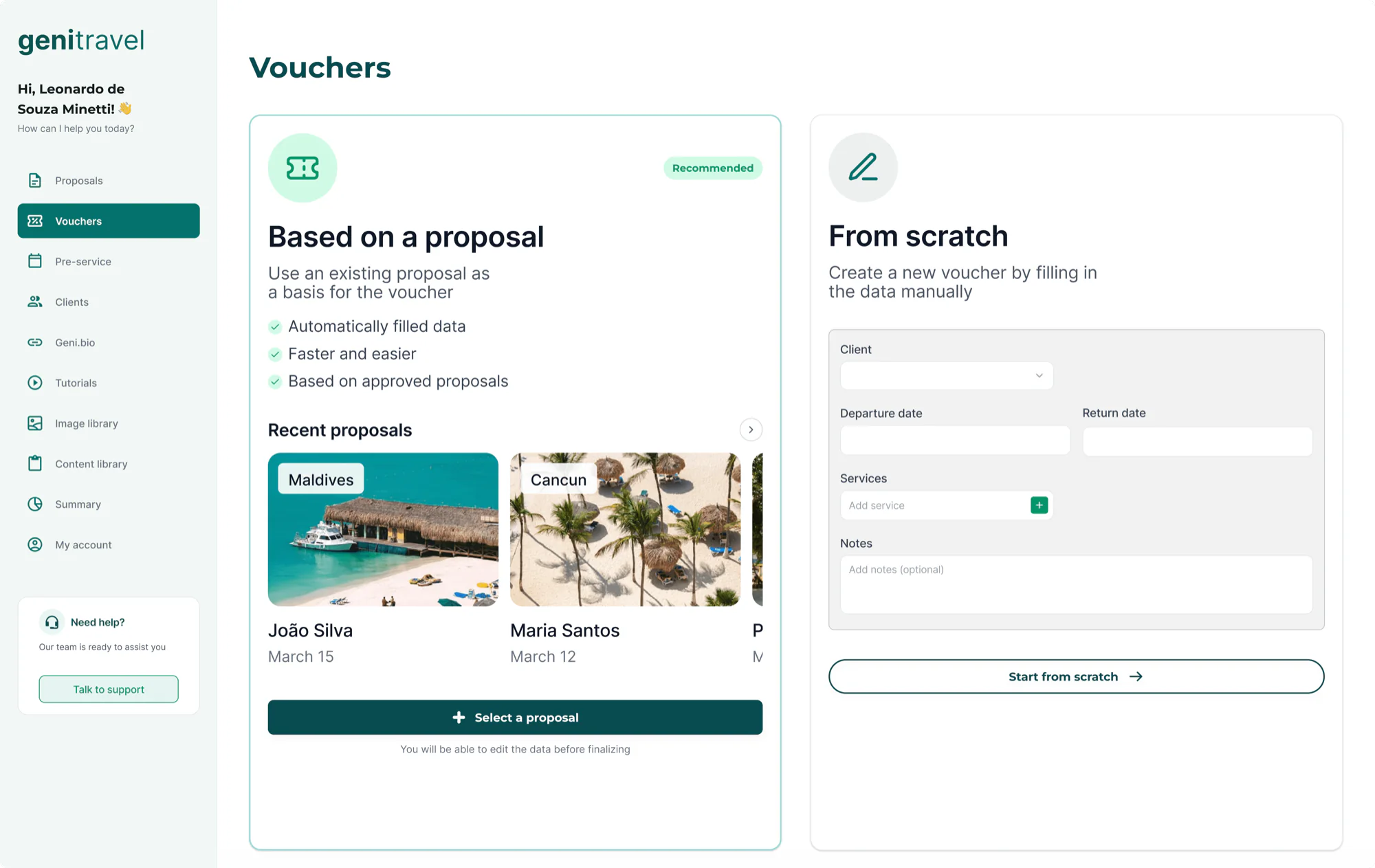
The reflection on the flows showed what had to change in the existing tools. Two main flows came out of it: creating a voucher from an accepted proposal, which reuses its data automatically, and creating one from scratch, for when there is no proposal or the voucher must be fully customized.
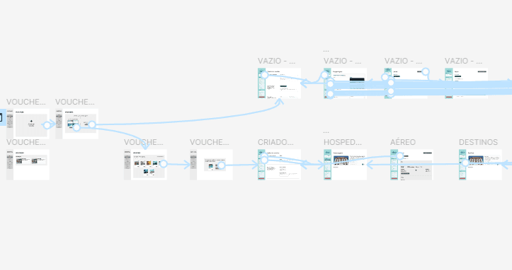
Flow map
The flows mapped step by step, so the voucher tool's flows would be functional and intuitive.
Sketches before screens
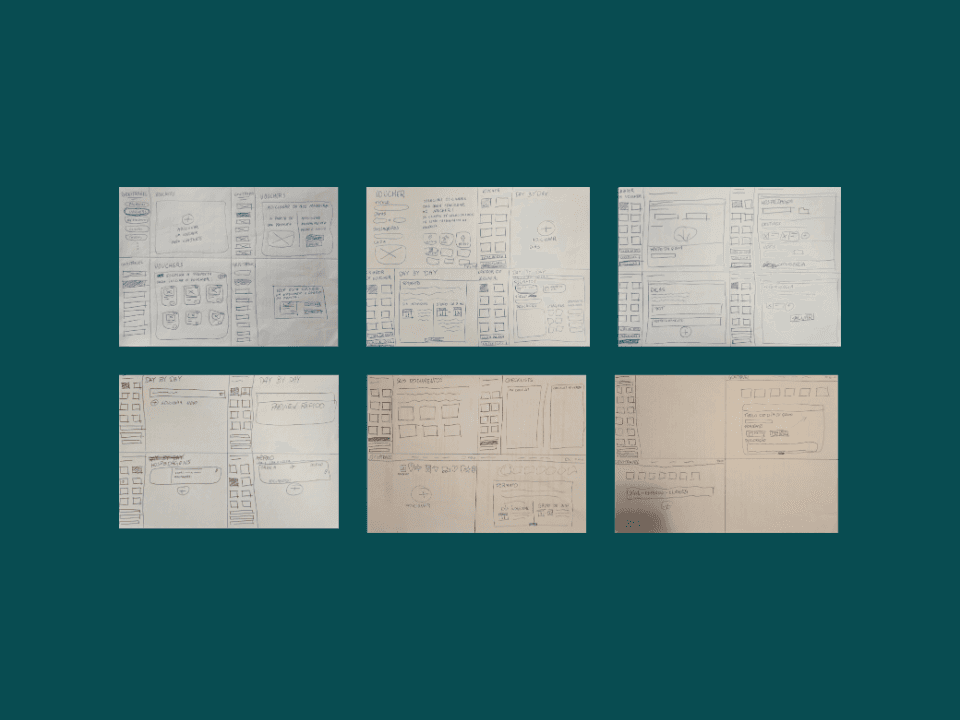
I started on paper, to visualize ideas outside the digital environment: it made abstract concepts concrete and showed which points needed more refinement before the digital prototype.
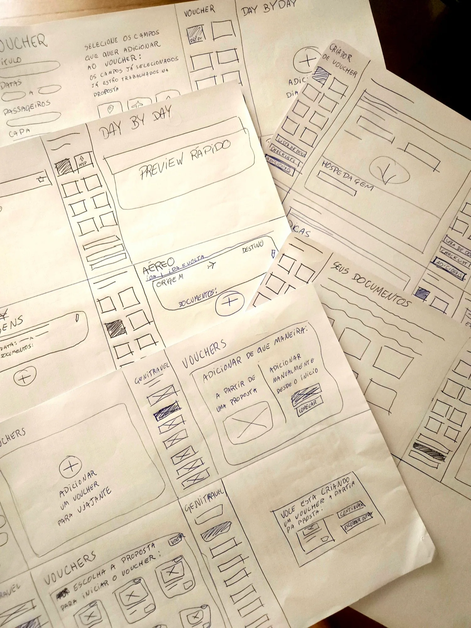
More paper sketches
Quick adjustments based on the first insights, before moving on to the digital prototype.
Wireframes
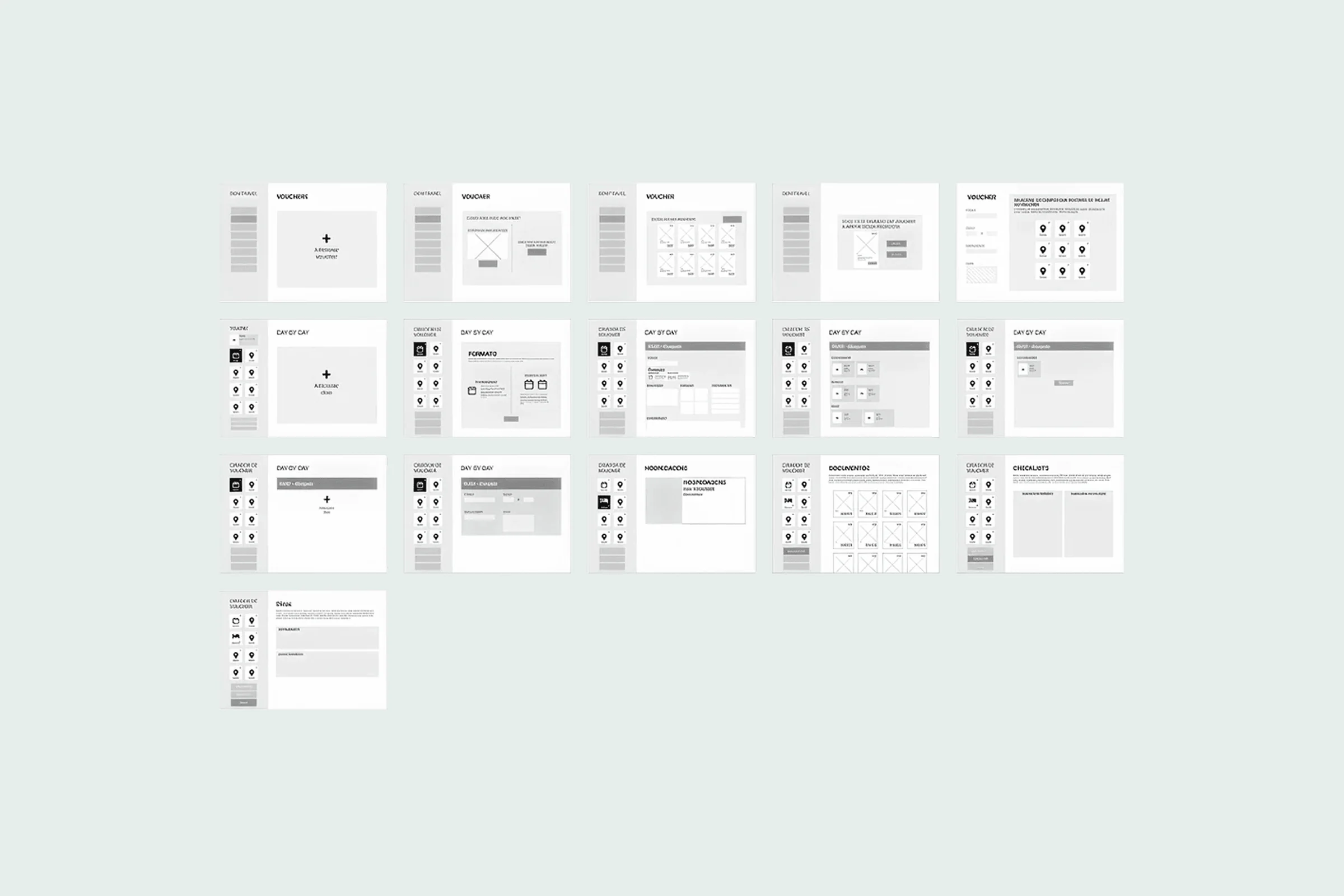
Low-fidelity wireframes of the voucher and day-by-day screens, the step that followed the paper sketches.
Solution
Four product decisions shaped the experience
A few choices made the workflow more useful, scalable, and aligned with real agent behavior and necessities.
Solution 1
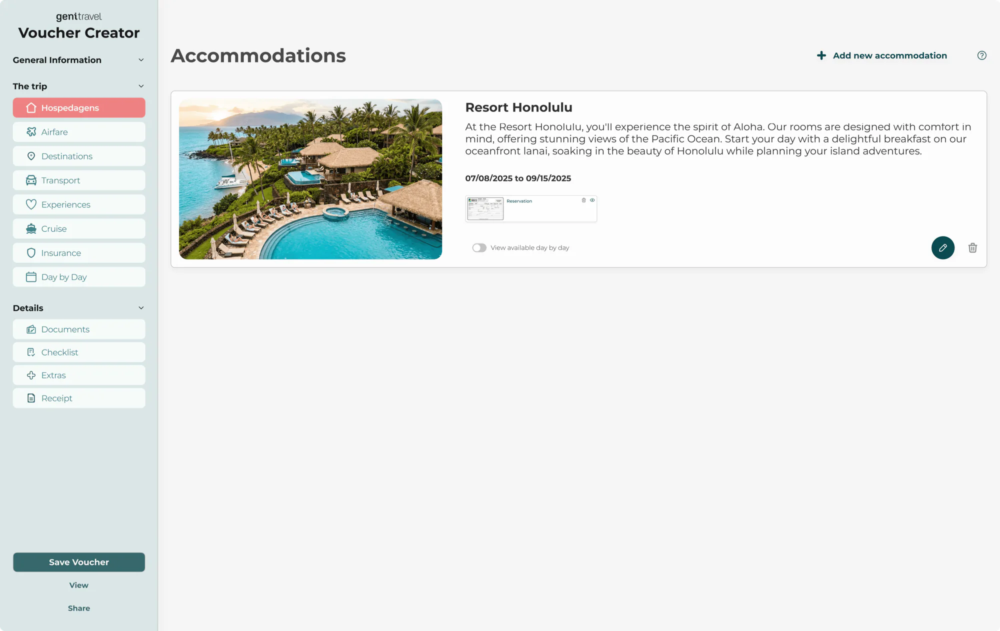
Reuse proposals or create vouchers from scratch
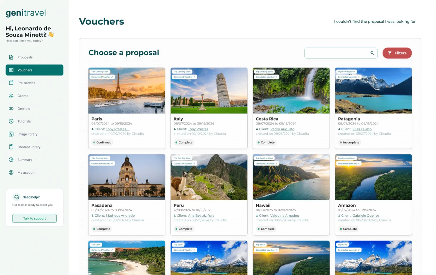
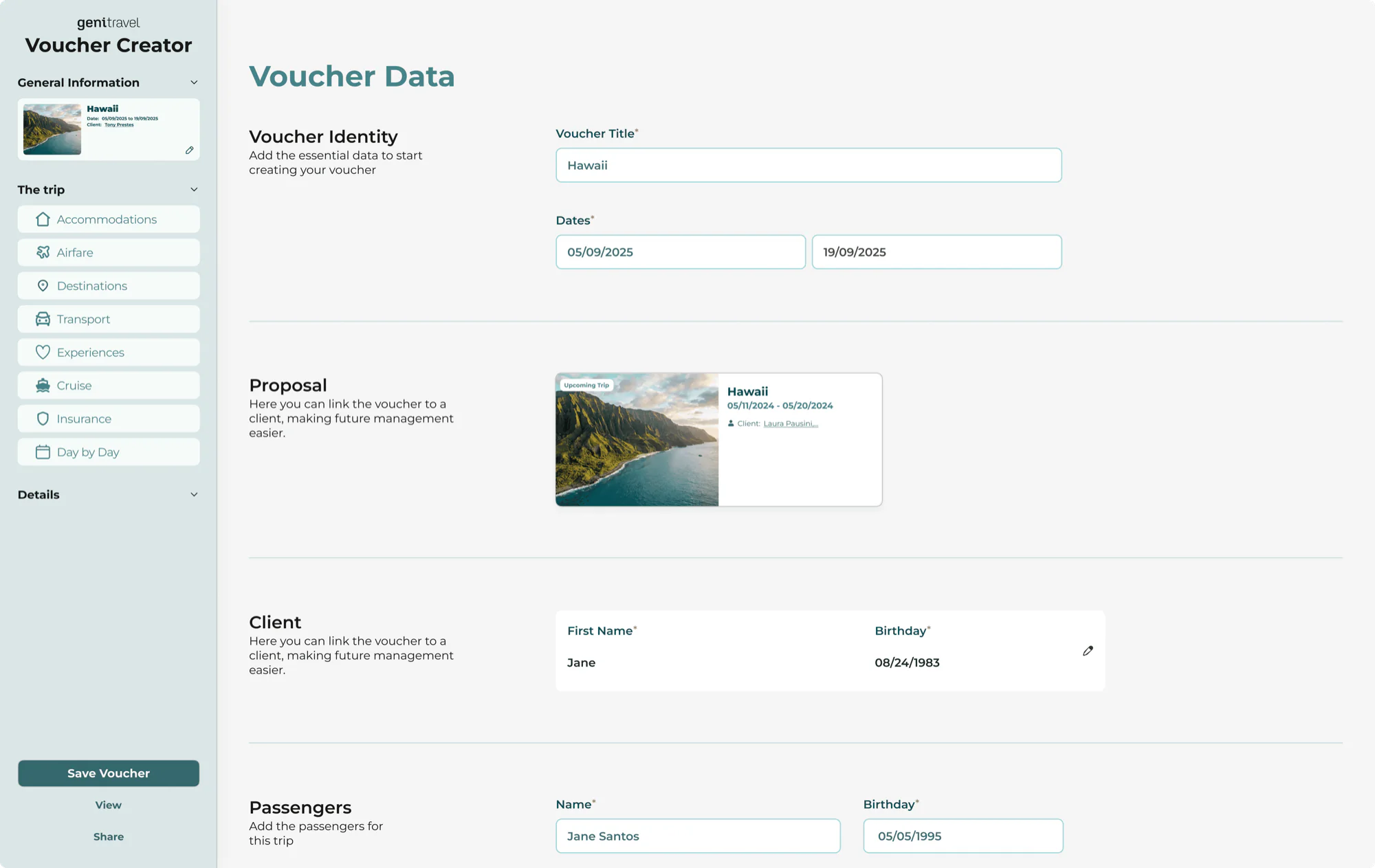
I designed the workflow so vouchers could be created directly from approved proposals, reducing duplicated effort and helping agents move faster if necessary.
Solution 2
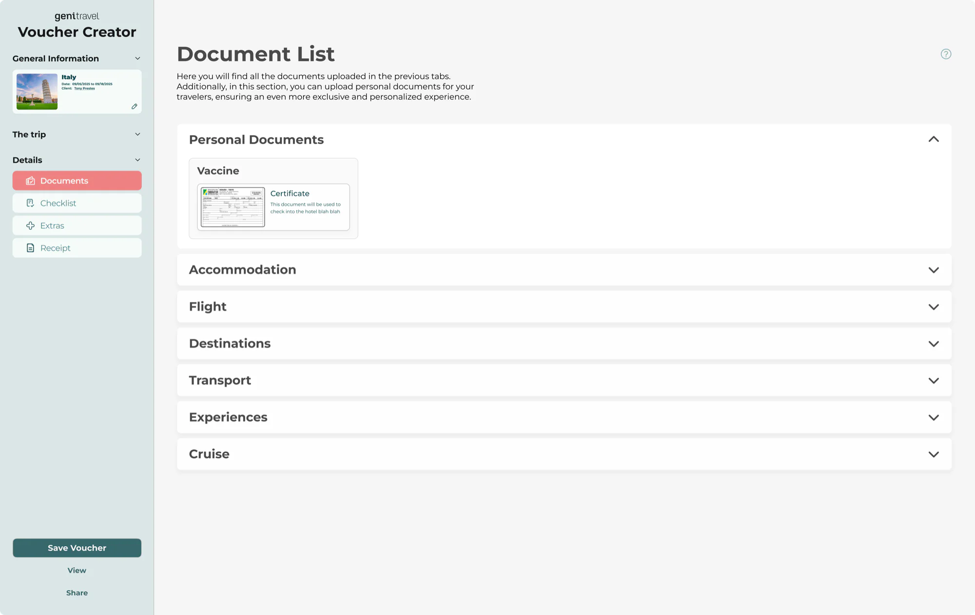
Structure voucher creation as modular content blocks
Instead of treating voucher creation as a long, linear form, I structured the experience into independent content blocks, each representing a specific part of the trip, such as accommodations, transport or different experiences, more flexible and easier to manage.
Solution 3
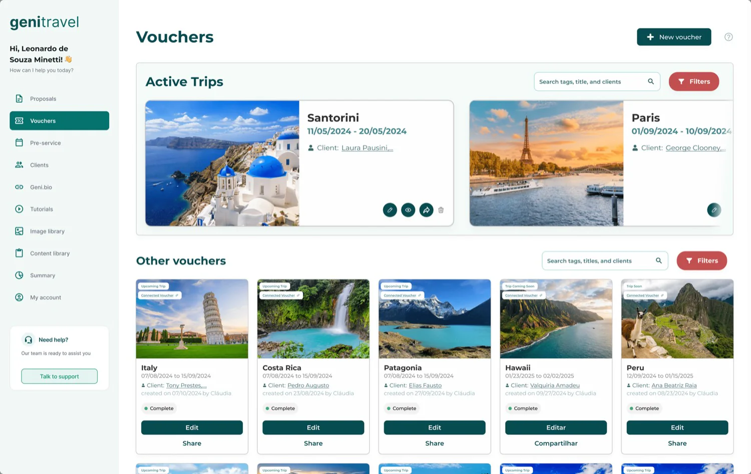
Make vouchers an operational tracking tool
I introduced a voucher board organized by trip status, giving agents clear visibility over ongoing and upcoming trips, and what requires attention.
Solution 4
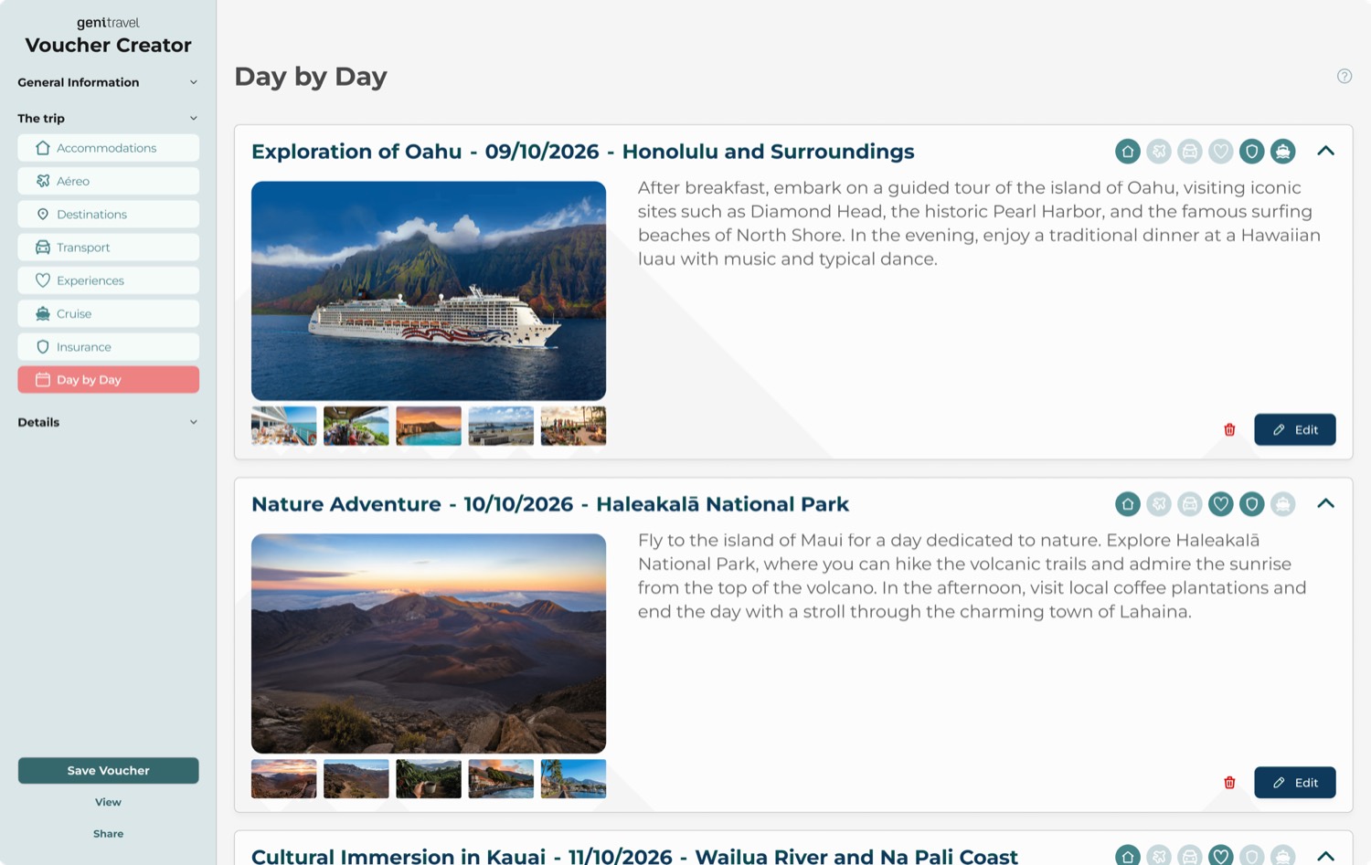
Design a clear day-by-day structure
I introduced an accordion-style layout that organizes trip details by day, making content easier to understand for both agents and travelers without overwhelming the interface.
Solution
A dedicated voucher workflow built for clarity and usability
Agents no longer stretch proposals into delivery documents: the voucher is a workflow of its own, created from an approved proposal or from scratch.
- Travel information structured in a clear, readable format
- Simpler navigation between proposals and vouchers
- Better content organization and hierarchy
- Faster, more confident decisions
The experience shifted from managing proposals to delivering complete travel experiences.
Results
A better fit of product and how agents actually work
From a product perspective, the experience became more aligned with how agents actually work.
Reduced friction in delivering travel information
Improved organization across proposals and vouchers
Created a stronger foundation for future product evolution
Other cases
All cases
From data to decisions: rethinking exploration in iOverlander
Rethinking the exploration experience so travelers move from scattered data to fast, confident decisions on the road.
What if you could just ask your audience a question?
Static audience segments reimagined as AI-powered personas that respond, explain, and stay grounded in real research data.