From data to decisions: rethinking exploration in iOverlander
iOverlander is a community-driven platform that helps travelers find and share places around the world. The product struggled with navigation, trust in content, and difficulty turning data into usable decisions.
In 30 seconds
Problem
The app held a wealth of user-generated data, but showed all of it with equal weight, so travelers struggled to find reliable places fast.
What I did
Redesigned the discovery experience: a clearer information hierarchy, cleaner map pins and simpler navigation between map and list.
Result
One continuous check-in form (down from 10+ screens) and faster decisions on the road, with clearer signals of quality and recency.
Overview
iOverlander is a community-driven travel platform used by overlanders to find campsites, services and points of interest worldwide. Its content is generated by the users themselves, and it is used mostly on mobile, often on the road.
Problem
The discovery paradox
iOverlander houses an incredible wealth of user-generated data, but the sheer volume had become a liability. The interface presented information equally, regardless of relevance, forcing users to sift through noise to find basic necessities while on the road.
- Users struggled to find relevant places quickly.
- Information was dense and hard to scan on mobile devices.
- Lacked visual trust signals for recency and quality of reviews.
- Navigation mismatch between map view and detailed list views.
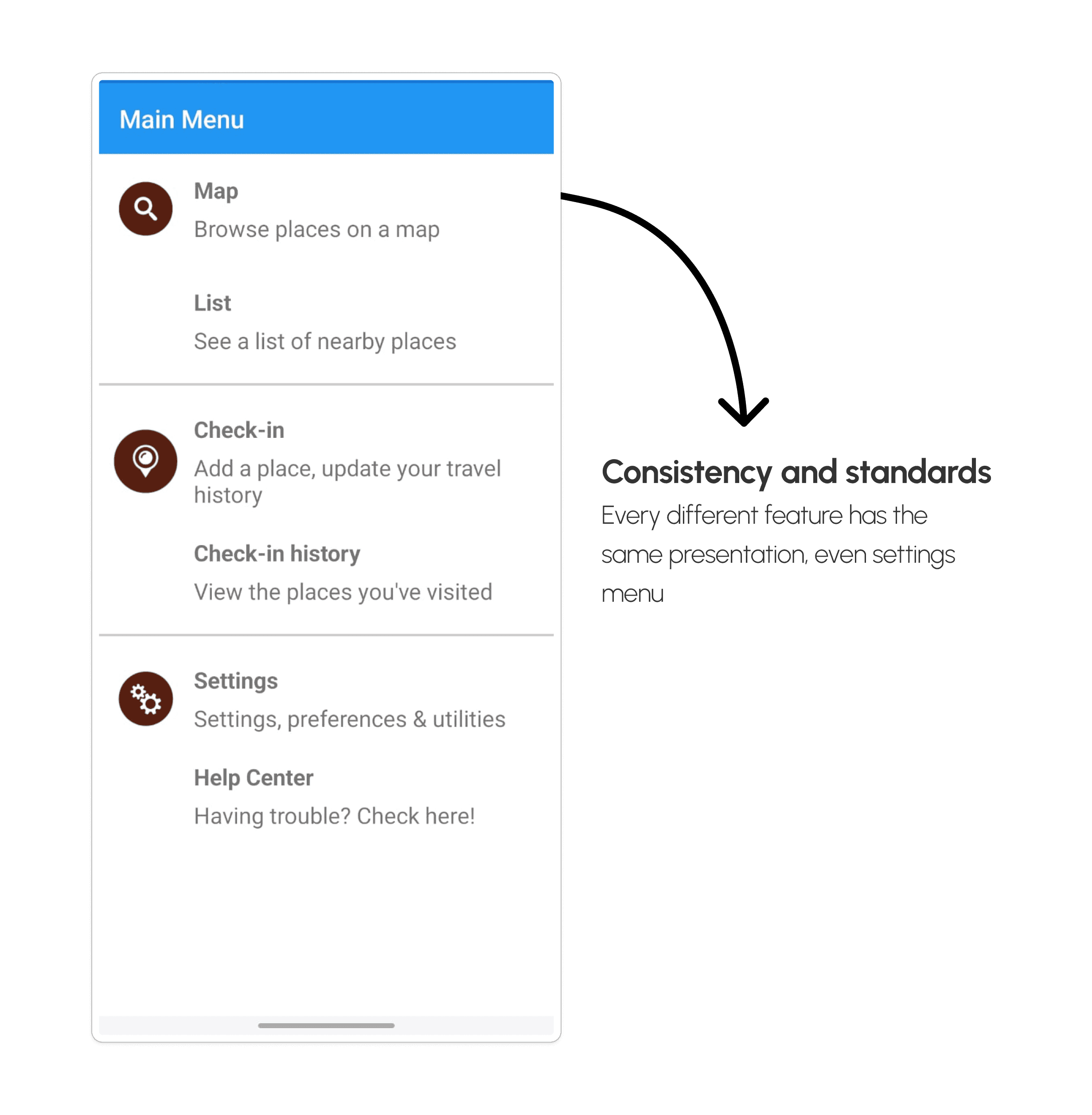
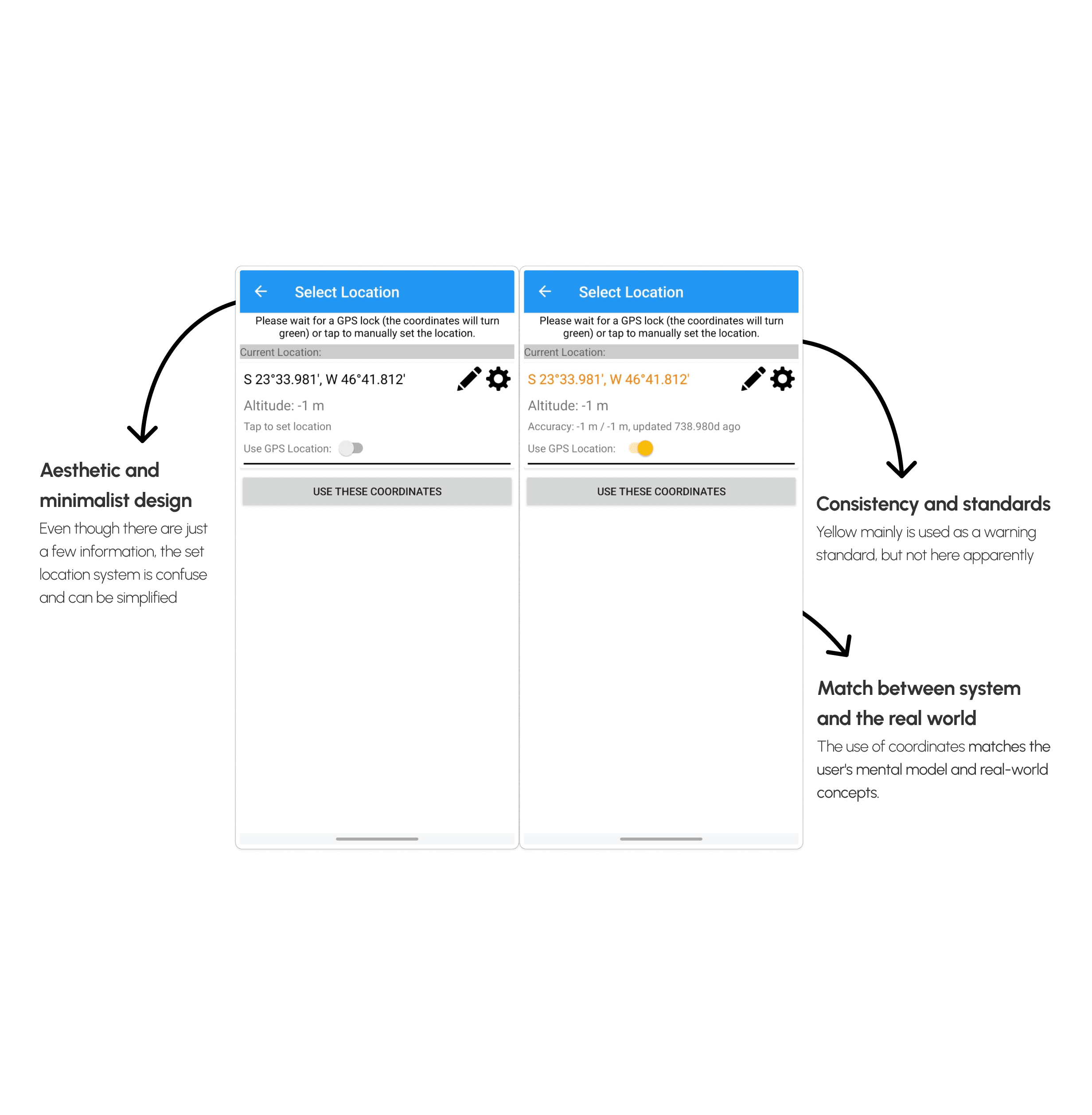
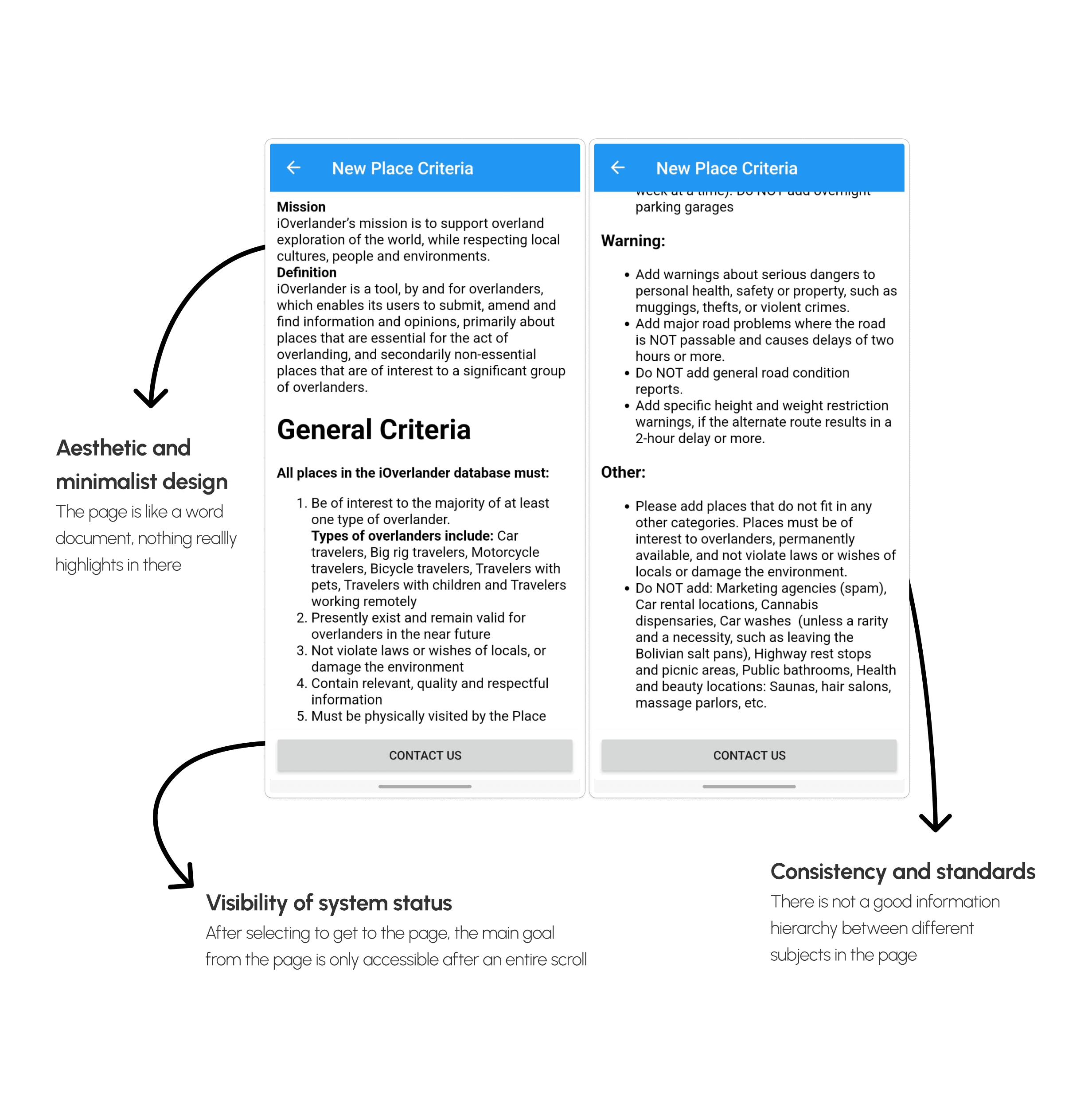
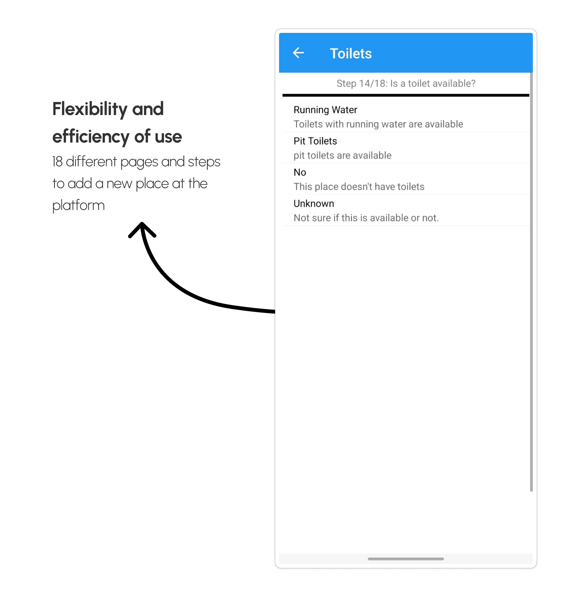
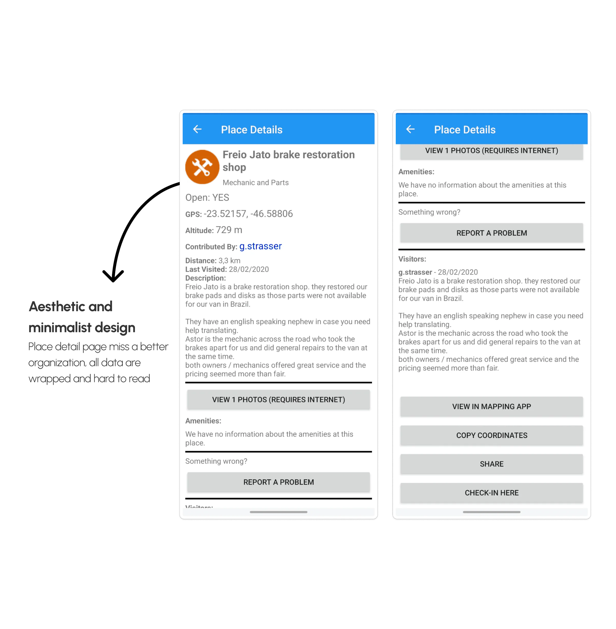
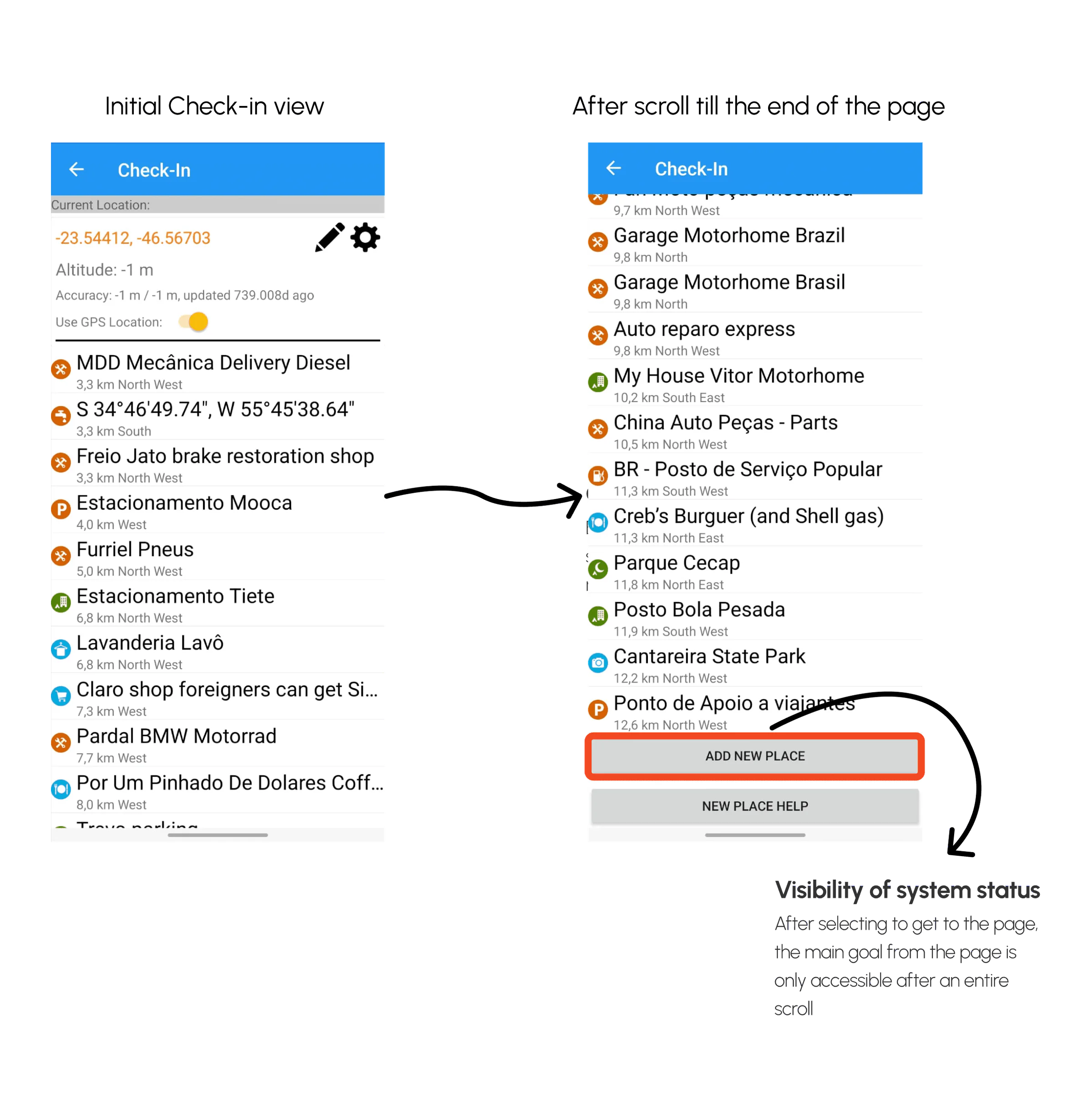
Users weren’t struggling with lack of data, they were struggling to understand, trust, and act on it quickly.
Process
How the work got there
From hypotheses to wireframes: the research, definition and sketching behind the decisions.
Hypotheses
Taking stock of what I knew so far, I wrote down six hypotheses to guide the next step: the user interviews.

User interviews
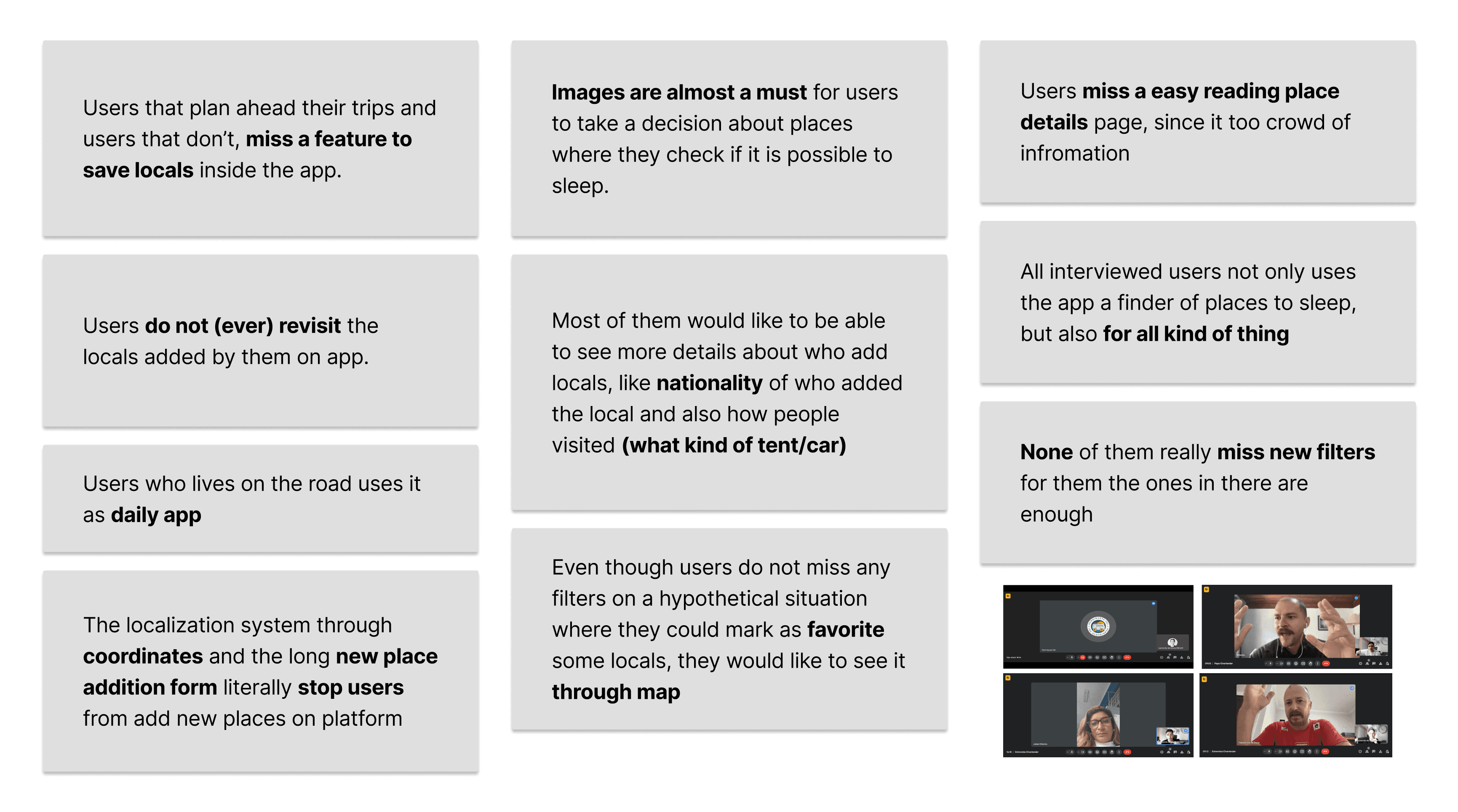
Five interviews with overlanders, recruited on Instagram (mostly couples and people traveling by van, car or trailer) and held in a single week. The insights below are the pain points they reported.
How Might We
With the interview insights in hand, I ran a How Might We exercise split by the topics users brought up: place details, saving places, adding new places and the home page.
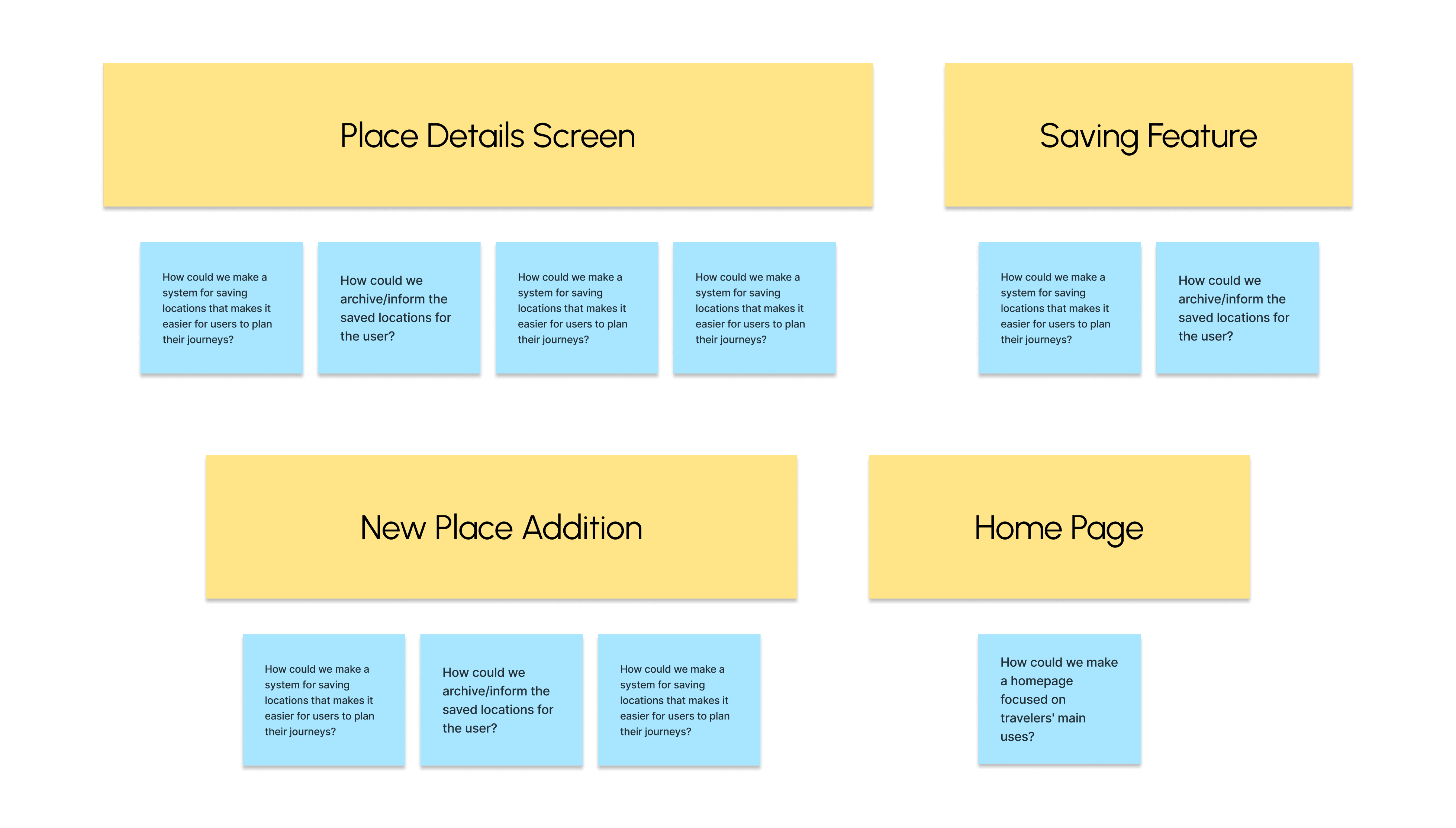
Brainstorming solutions
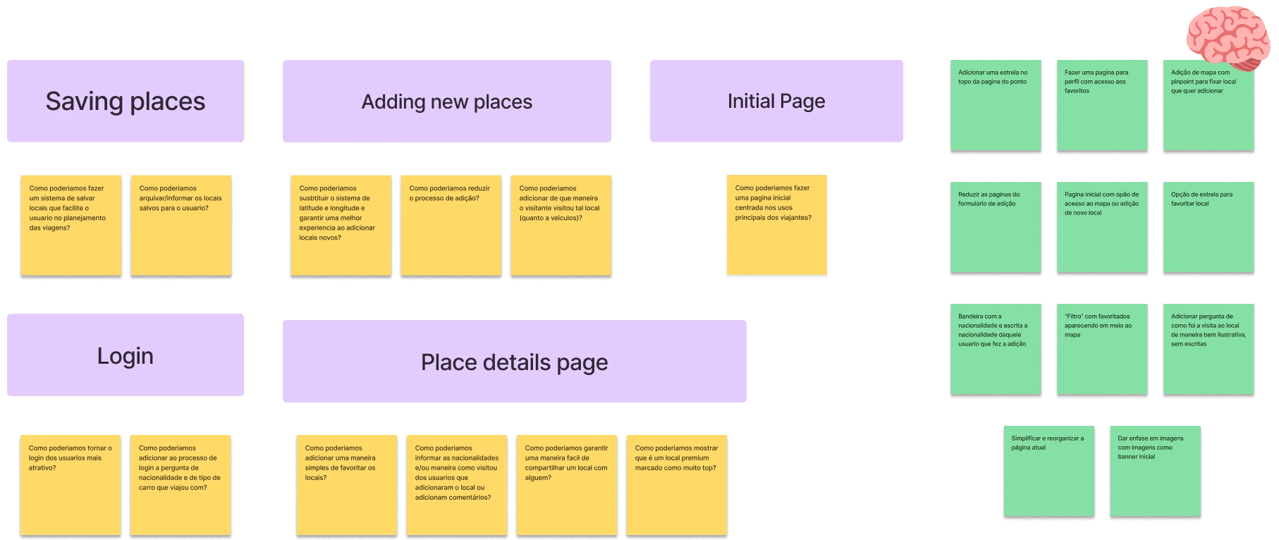
For each topic, a brainstorm of possible solutions. The ideas were left mixed on purpose, to make room for solutions that cross topics.
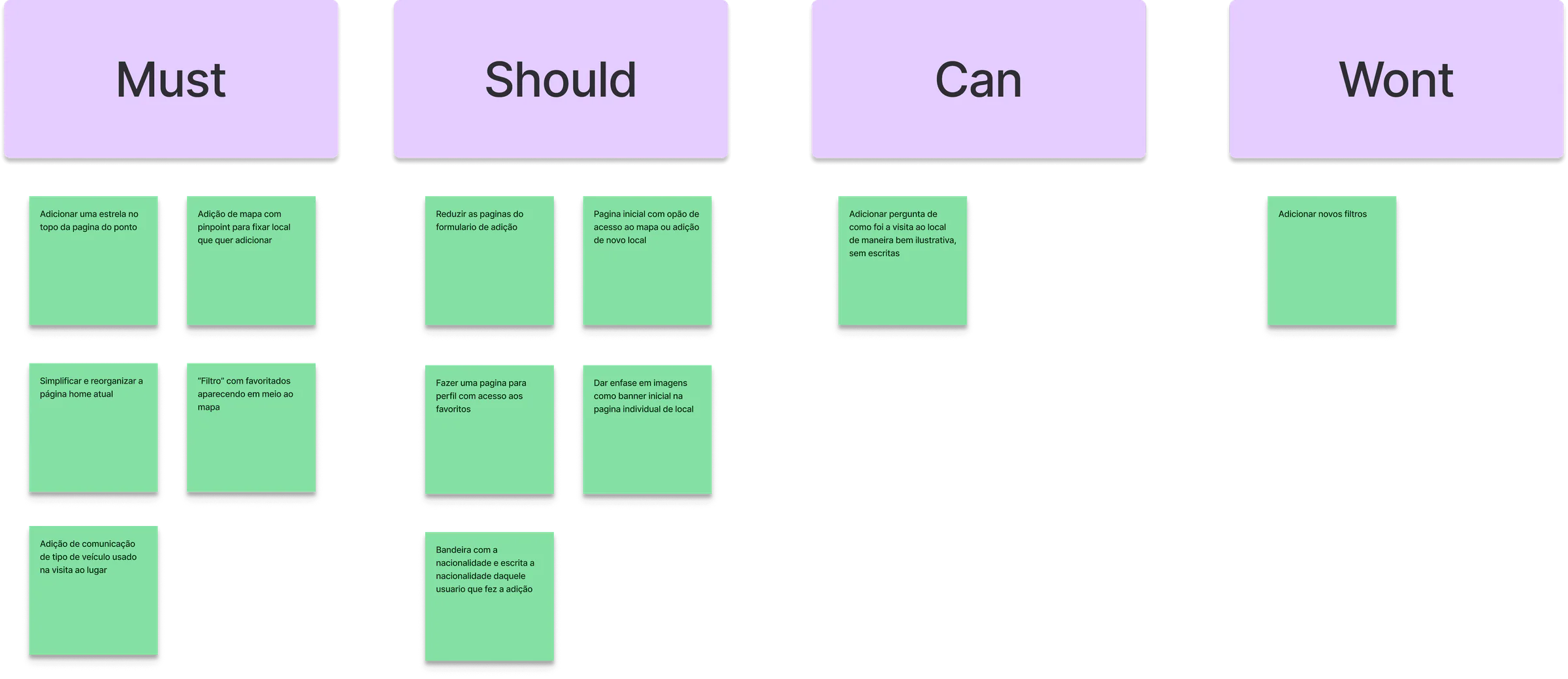
MoSCoW prioritization
The ideas sorted into Must, Should, Can and Won't, to decide what would shape the start of the screen design.
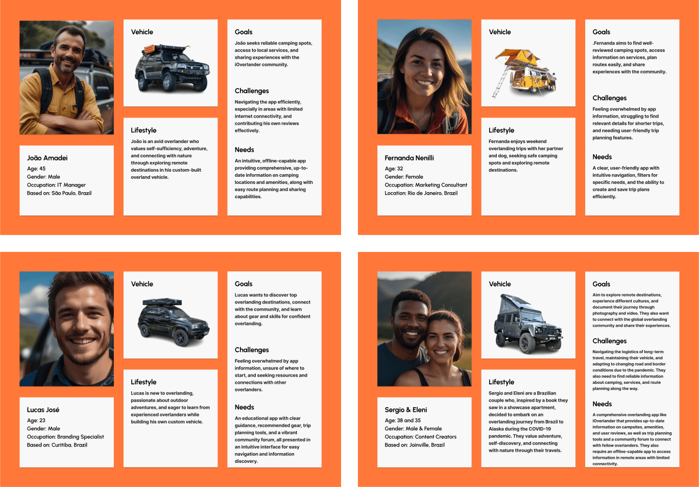
Personas
With a clear path on which solutions to test, I drew four personas from the interview cases to check whether I was missing any opportunity.
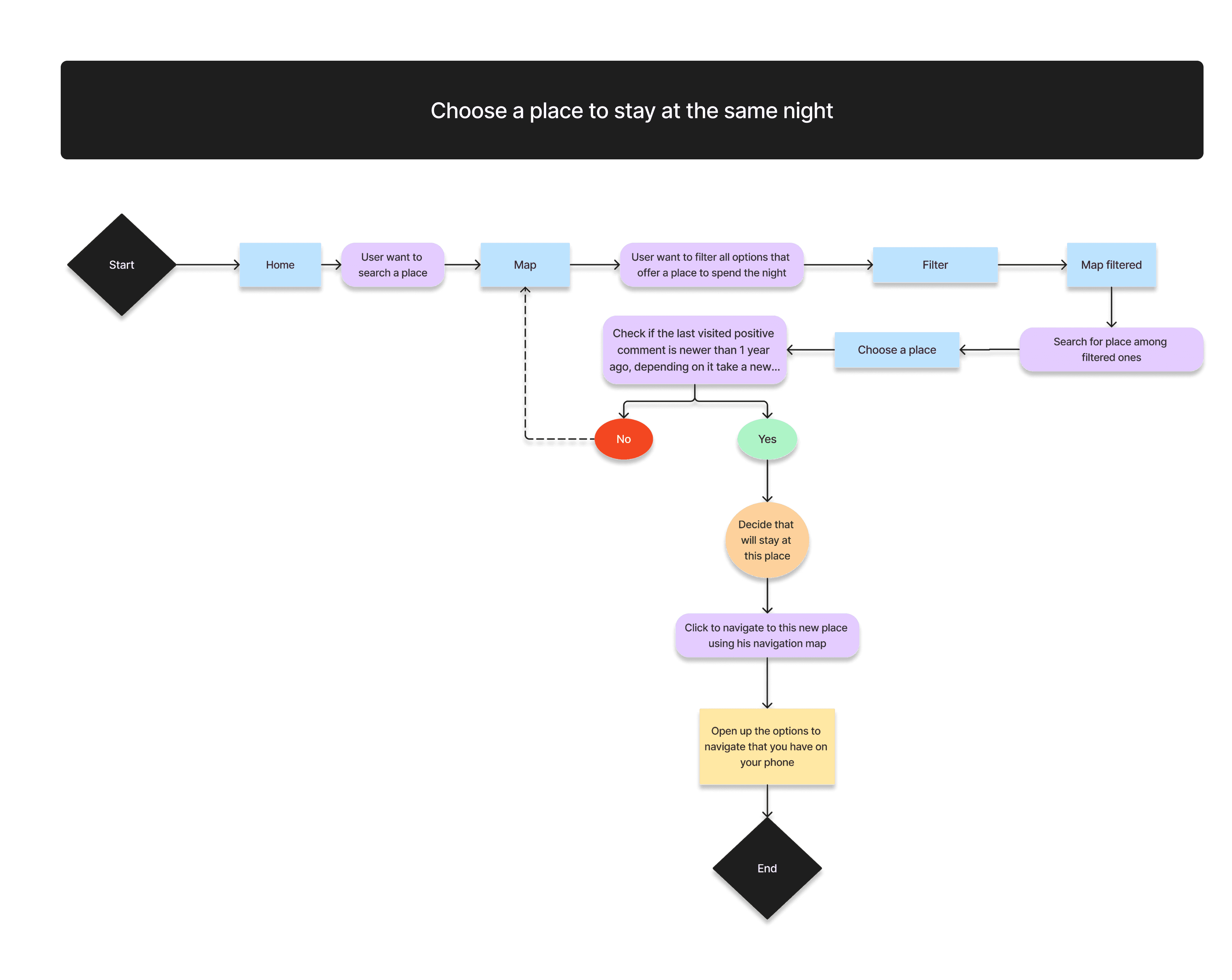
User flow: choosing where to stay
The flows were the exercise that helped me most: they showed how bad the current experience was. This one covers choosing a place to stay for the night.
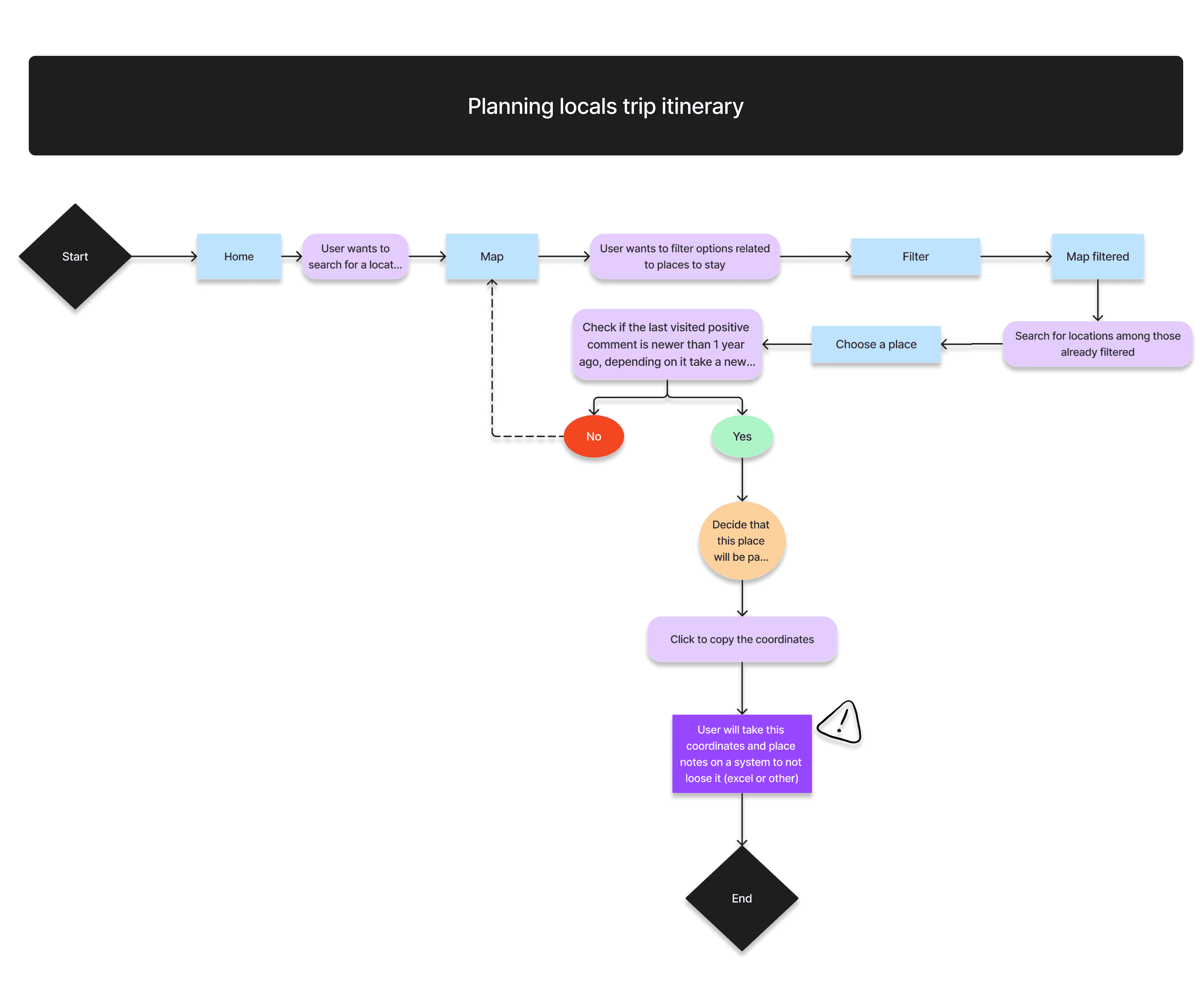
User flow: planning the trip
Three flows in total, all built on the interview insights, for example that not everyone plans places before hitting the road, as I had assumed.
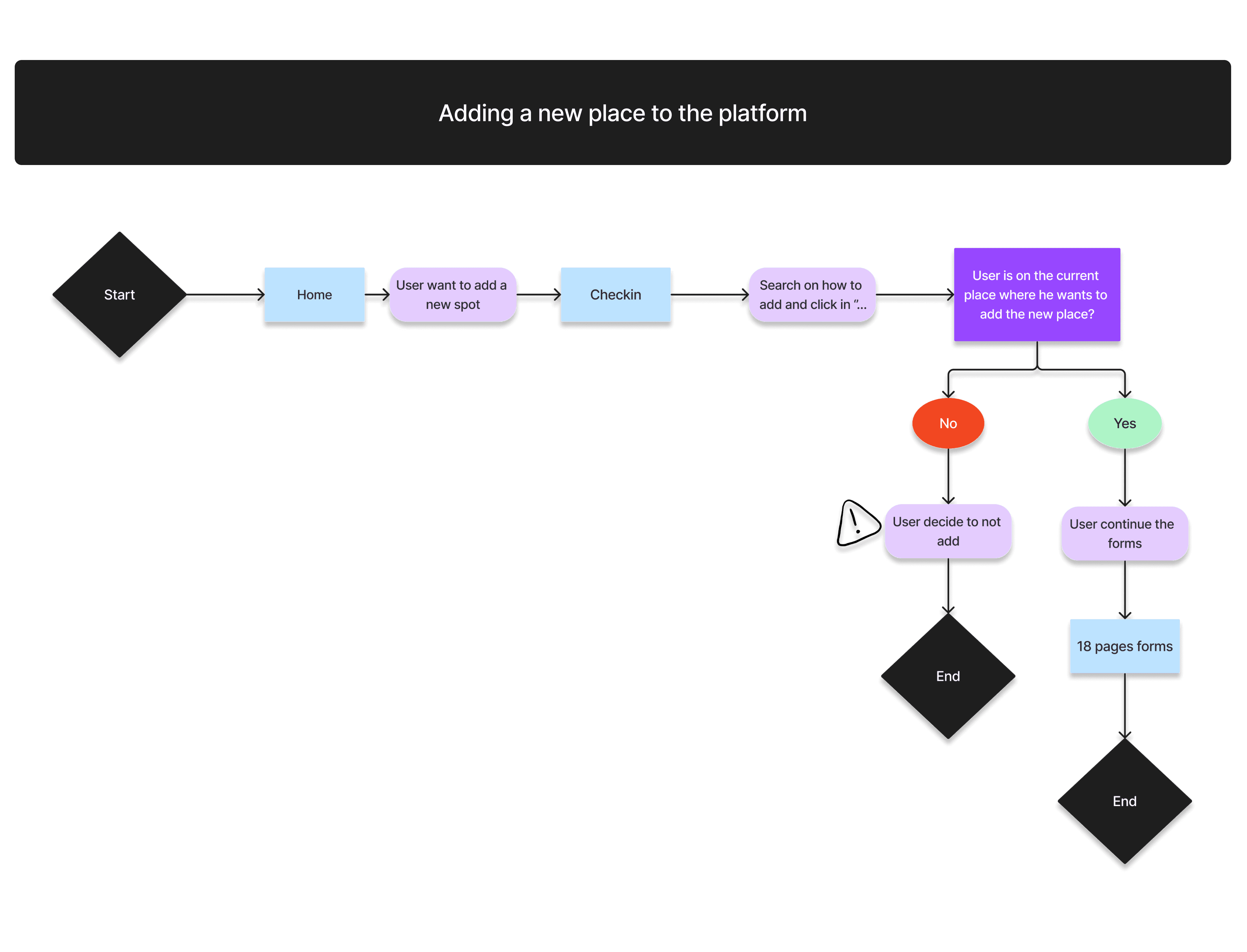
User flow: adding a place
The flow that showed the biggest problem: an 18-page form, and having to be at the exact spot (or know its coordinates), literally stop users from adding places.
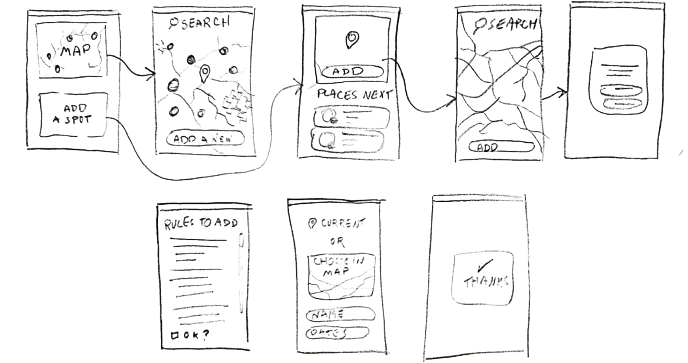
Sketches before screens
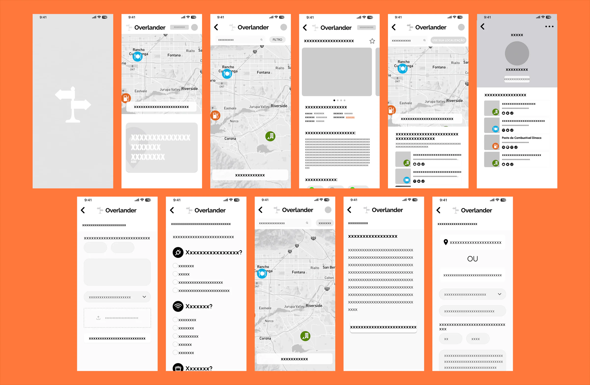
With the problem defined, I picked up paper and pen to sketch an ideal redesign before opening Figma.
Wireframes
The sketches guided the medium-fidelity wireframes, where I planned the layout and content structure around what users needed.
Solution
Decisions and approach
Solution 1
Scannability over density
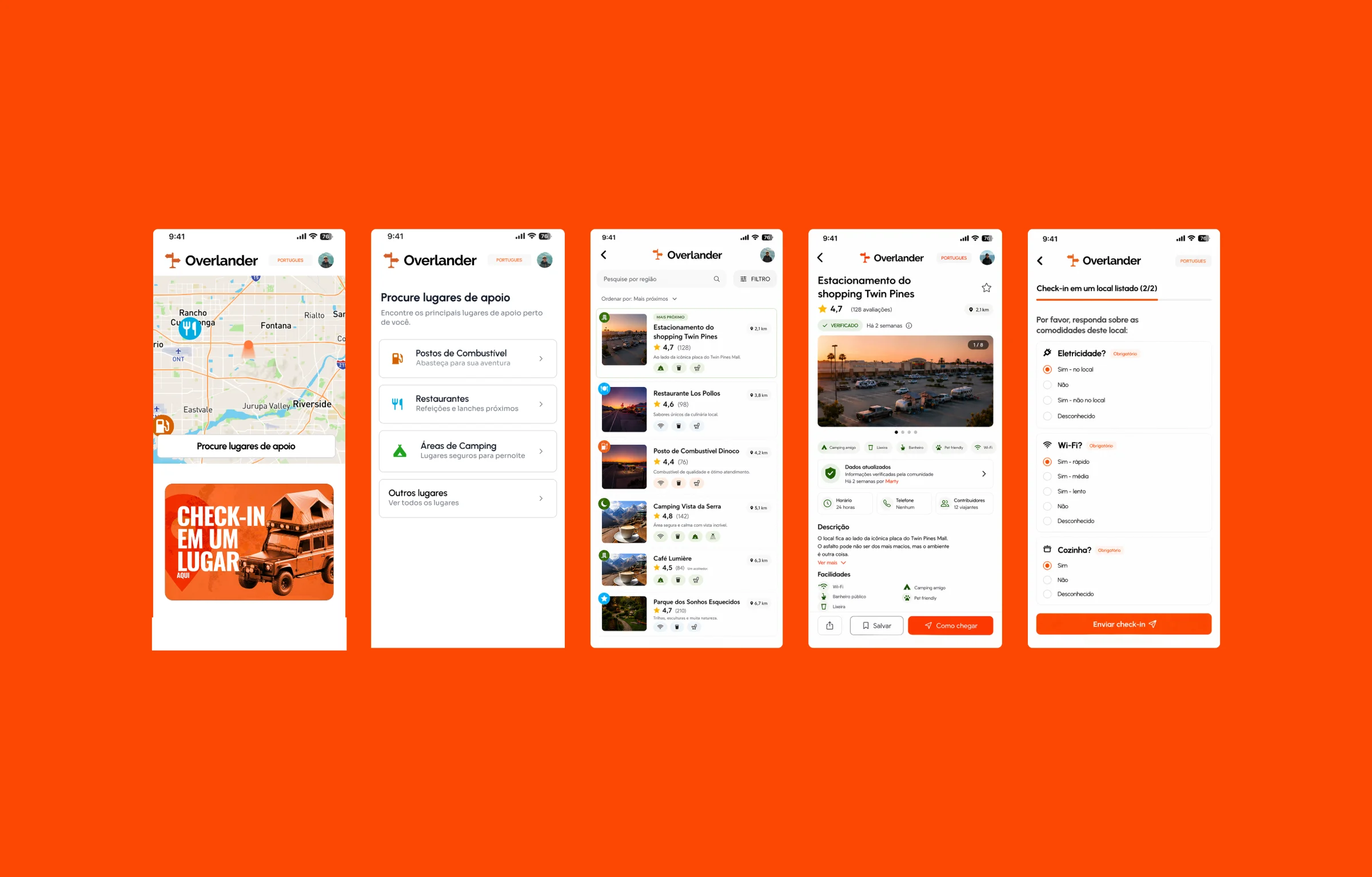
Restructured the place cards to highlight critical decision-making factors first: category icon, exact distance, and an aggregated sentiment score, pushing granular text reviews down the hierarchy.
Solution 2
Real behavior alignment
Designed primary user flows around immediate needs ("Find fuel near me now") rather than open-ended browsing, reducing time-to-action.
Solution 3
Trust through context
Introduced clear visual indicators for data freshness. A location verified yesterday visually outranks one untouched for three years, like it should be.
Solution 4
Simplifying check-in to a single flow
Reduced the check-in experience from a fragmented, multi-step flow (10+ screens) to a single, continuous form optimized for real-world usage. Users can now scan, answer, and complete the process in one pass, reducing friction in on-the-go scenarios.
Solution
A clearer way forward
The final design brings structural clarity to the overlanding experience. Cleaner map pins and distinct typography hierarchy turn data into actionable intelligence.
Other cases
All cases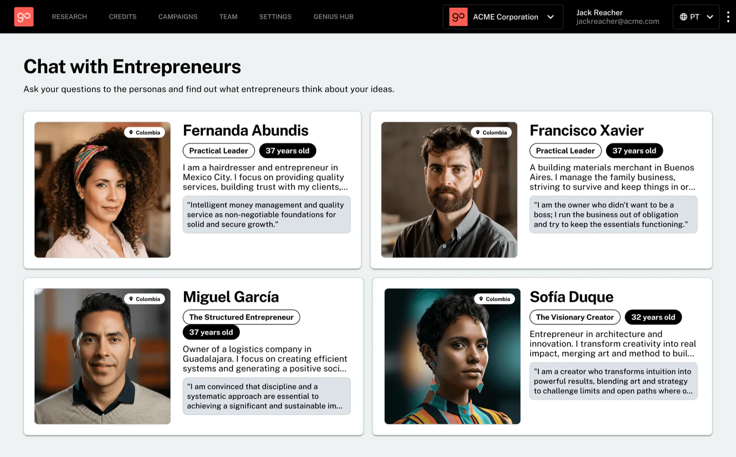
What if you could just ask your audience a question?
Static audience segments reimagined as AI-powered personas that respond, explain, and stay grounded in real research data.
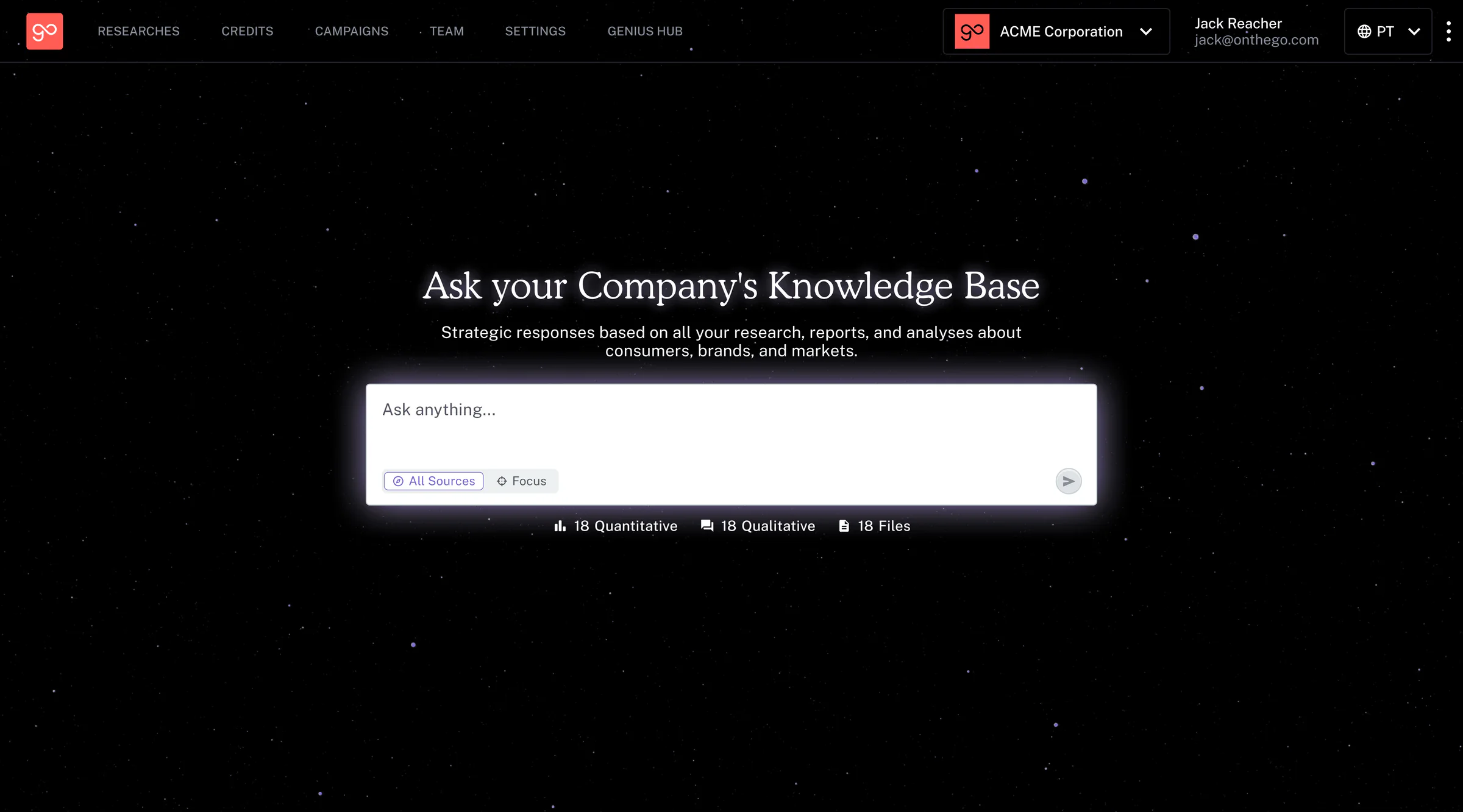
Building a connected system for research knowledge
A centralized intelligence layer that connects every study and insight into one conversational source of truth.