Making a 15-year-old printed guide compete with newer apps
Dois por um is a 15-year-old printed guide with 122 active 2-for-1 offers in São Paulo: you bring someone, the house pays for the second. It now competes with apps rated 4.5 to 4.9 stars, while its own app has 2.4 on the Play Store and 3.4 on the App Store. I read the reviews, benchmarked three competitors, interviewed five users and redesigned the site and a free companion app. The physical book is what almost nobody else has, so the digital side had to serve it. I directed the design and built it in code with Claude Code, then used AI to evaluate the result, keeping what is measured apart from what is opinion.
In 30 seconds
Problem
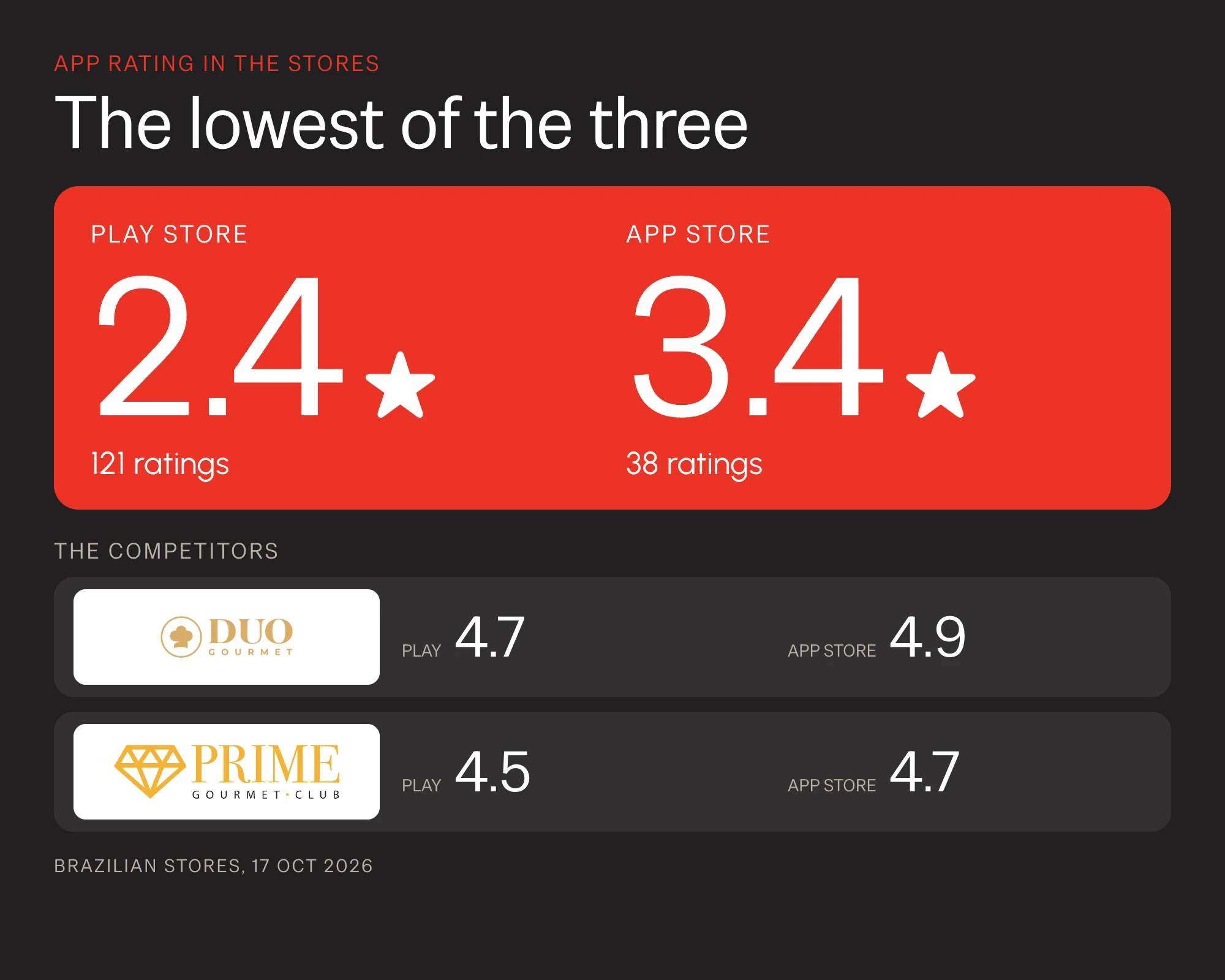
The app has 2.4 stars on the Play Store and 3.4 on the App Store, against 4.5 to 4.9 for the competitors. Reviews have asked for years for better filters, sharing and a view of the savings.
What I did
I read the store reviews, benchmarked 3 competitors, interviewed 5 users and built an immersive site and an app prototype in one visual language.
Result
The new site shows its main content in 1.7 s on a phone, not 11.1 s. The new app meets all 10 needs from the interviews, in a prototype with sample data. No test with people yet.
Overview
Dois por um is a guide of 2-for-1 offers in São Paulo restaurants, bars, hotels, spas and tours. It is on its twelfth edition, costs R$ 207 and arrives by mail. The offer only works with the physical guide, so the app and the site help you choose and find a place but never replace the book. This is a self-initiated case, not the product’s official site.
Problem
A 15-year-old brand was being overtaken by much newer ones
The guide created the habit of going out in pairs with a discount, but now shares that space with Duo Gourmet and Prime Gourmet, which live only in apps, and with Passaporte de Pinheiros, a book with no app. In the stores, Dois por um has 2.4 stars on the Play Store and 3.4 on the App Store, while the two competitors sit between 4.5 and 4.9. One interviewee called the app “a static PDF”.
- Competitors show more to decide: price range, days and hours, filters by neighborhood and cuisine, reviews.
- The stores asked for the same things for years: better filters, sharing with another person, rating places and seeing the total saved.
- The app did not use what only it has: the book, the notices of closures and the art gallery.
- The brand looked different everywhere: the site, the app and the book had different colors and type.
The design question: how can a 15-year-old brand compete with newer products by using what only it has, the book?
Benchmark
The benchmark showed where the app lost and what only Dois por um has
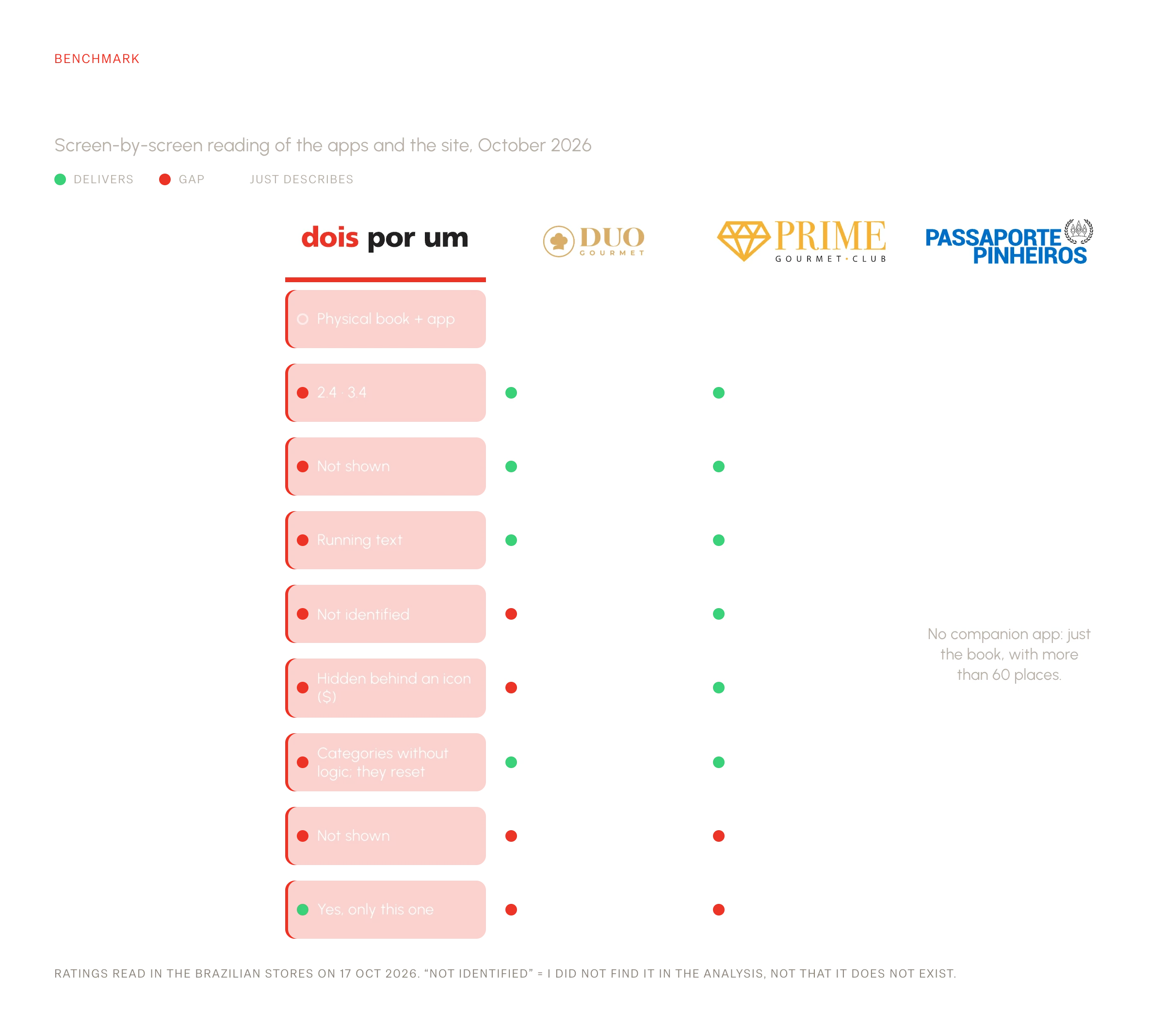
I read the current app and site and the two app-only competitors screen by screen, across eleven points. Passaporte de Pinheiros is a physical-book reference with no app.
Two conclusions steered the rest: what the competitors do better (information to decide and filters) became a list of gaps, and what only Dois por um has (the book, the notices of changes and the art gallery) became the center of the proposal.
One participant compared the current app to “a static PDF” and found it basic for the price of the guide.
Process
From what I heard to what I redesigned
What each discovery exercise changed in the decisions.
The research path
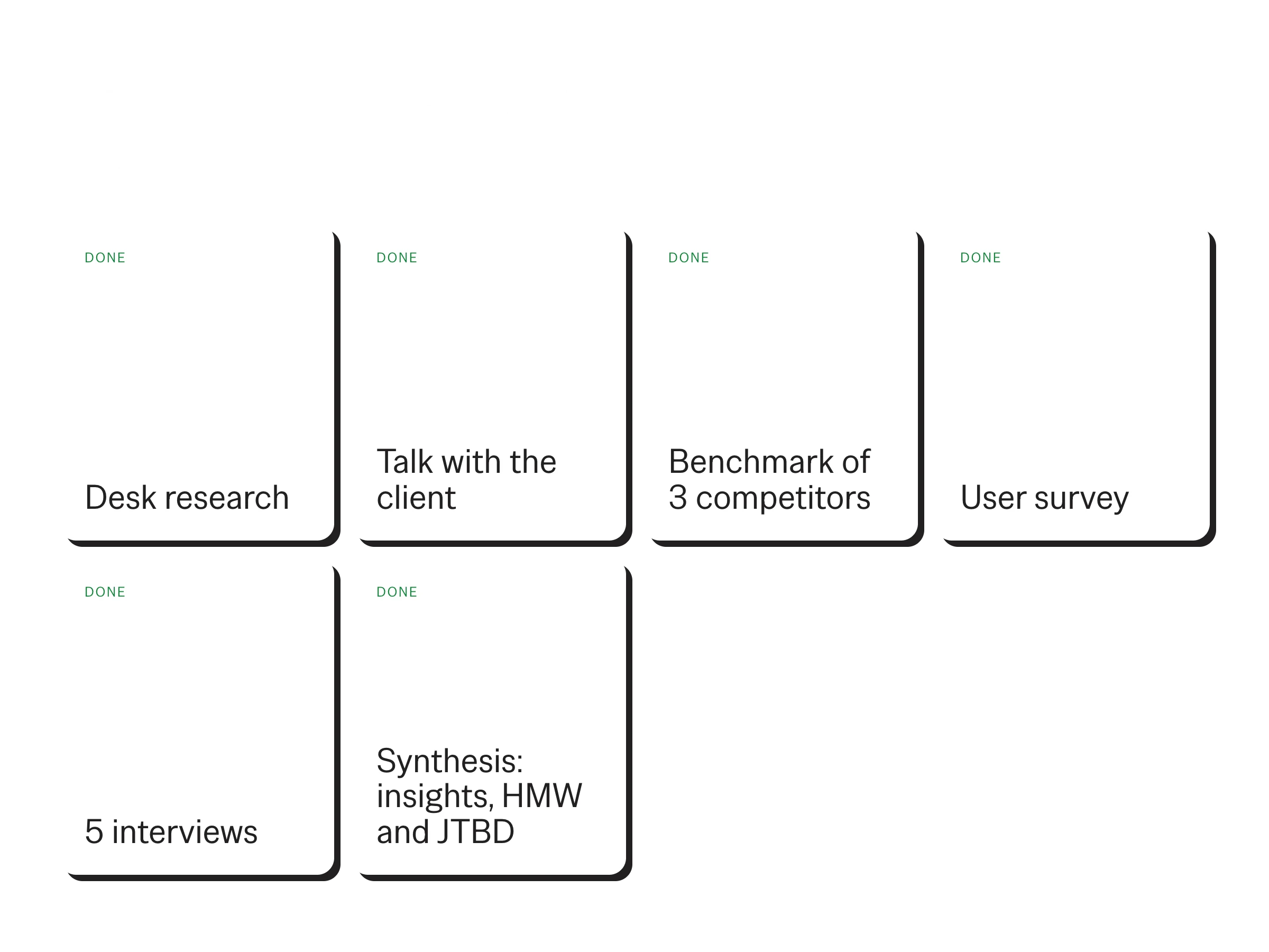
Desk research, a talk with the client, a benchmark and a survey, then five interviews and a synthesis into HMW and JTBD statements. A usability test, personas and the user flow are still to come.
Five interviews
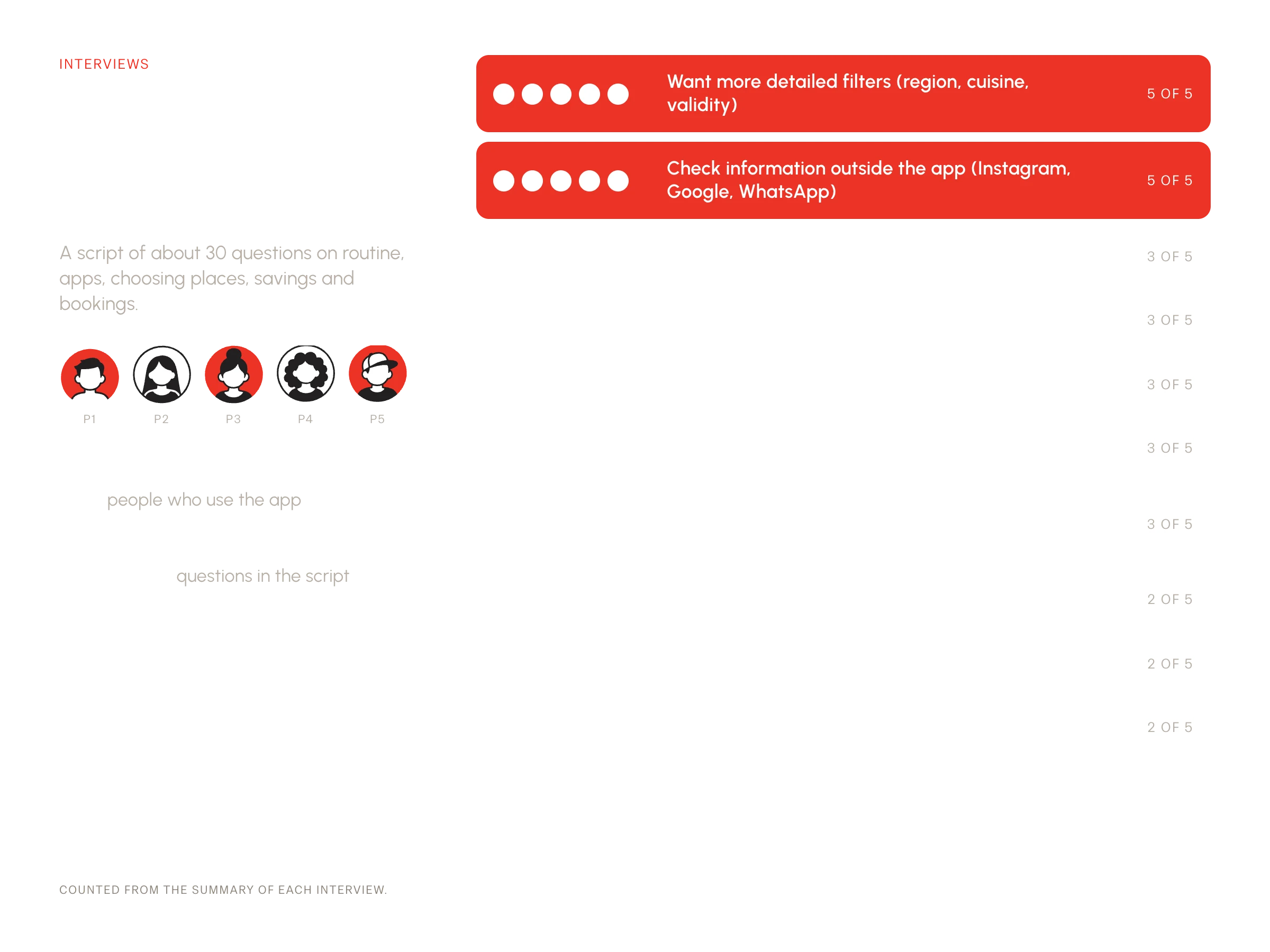
A script of about 30 questions on routine, apps, choosing places, savings and bookings. All five want more detailed filters and check information outside the app; three ask for payment methods, photos and menus.
Insights and opportunities
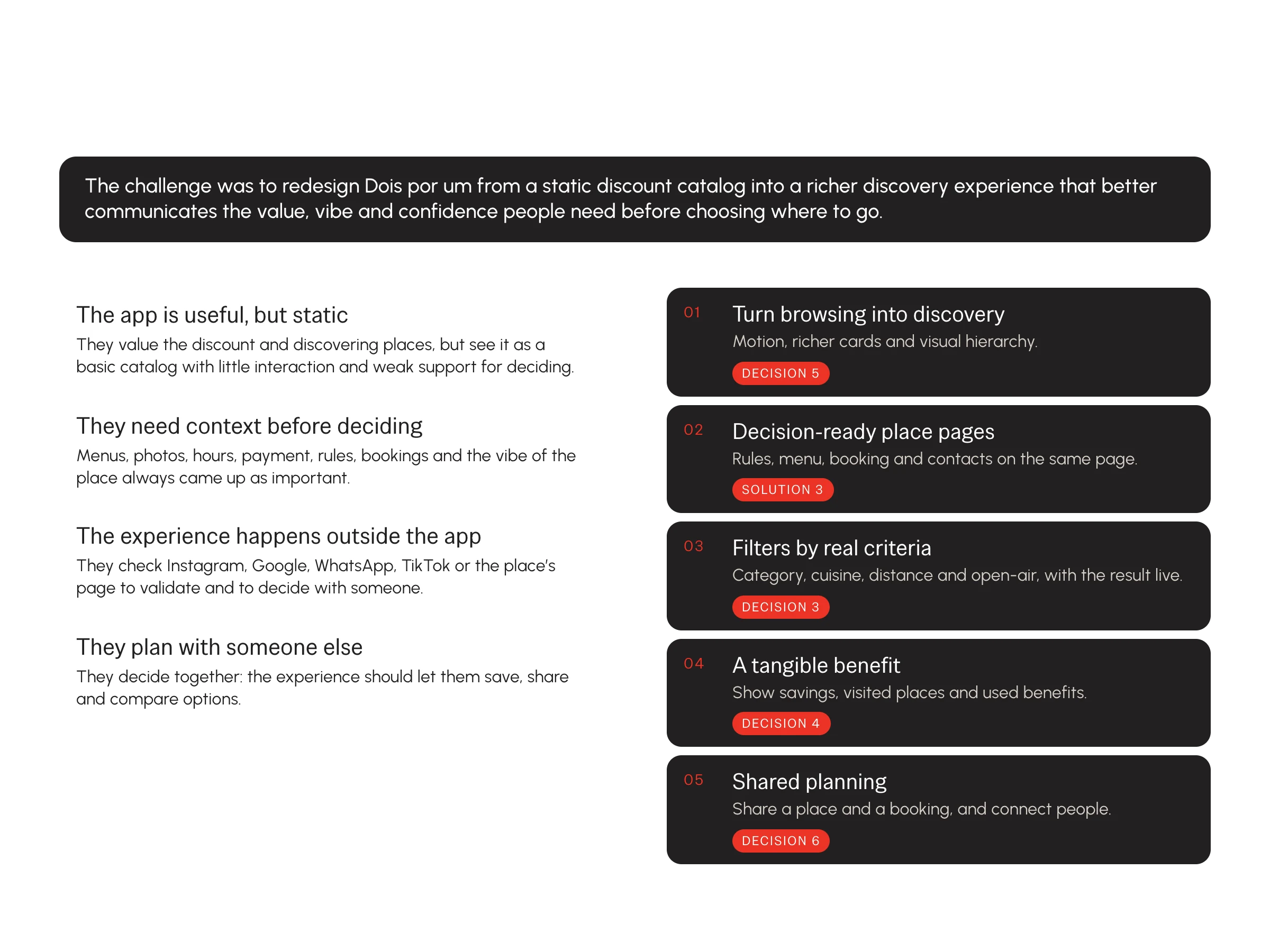
Six insights became five opportunities: turn browsing into discovery, decision-ready pages, filters by real criteria, a tangible benefit and shared planning.
The journey of someone using the guide
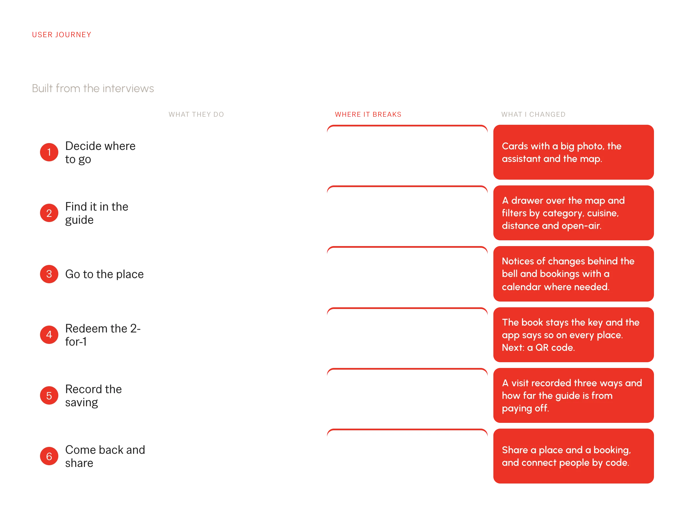
Six moments, from deciding where to go to coming back and sharing, each with its friction and what I changed.
Challenge
The digital side had to serve the book and match what apps do well
I decided early that the book is the hero. The app is a companion: it finds, filters, remembers and warns. It also had to close the benchmark gaps, or it would fall behind any new app.
The book stays the key
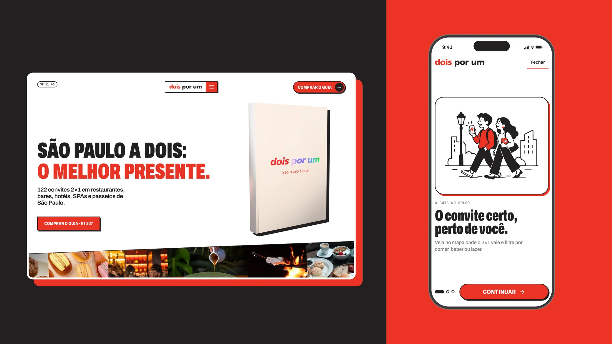
Every place says the offer needs the guide, and the 3D book opens the home page.
The app closes the gaps
Real filters, information to decide, savings in sight, bookings and connections.
Key decisions
Six decisions, each tied to something I saw in the discovery
Constraints shaped most of them: one brand with three colors, no real menus or availability, and a prototype that had to be honest about it.
Decision 1
The book leads, the app follows
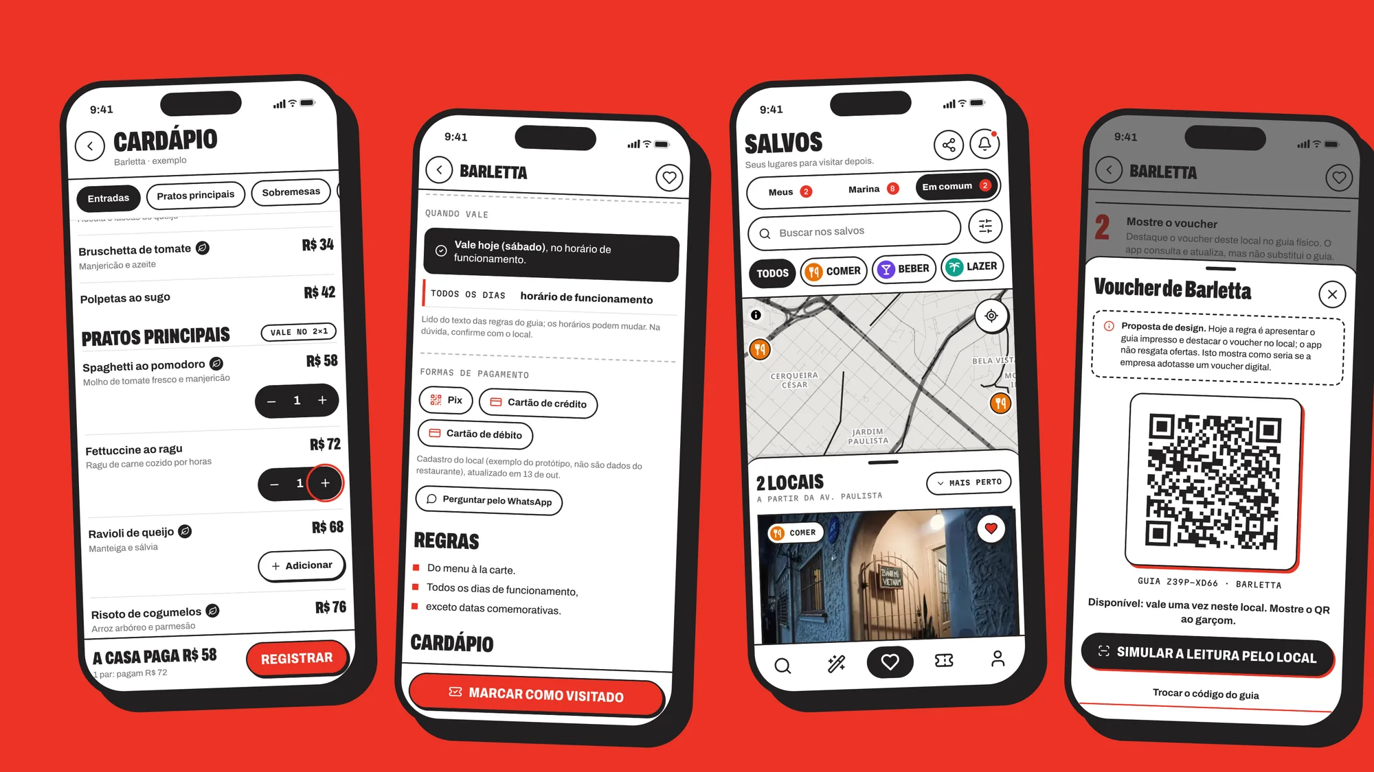
Only Dois por um has both a physical book and an app, so the 3D book leads the hero and every place says the offer needs the guide. Two interviewees find the book a hassle to carry, so I designed a digital voucher with a QR as a proposal, marked as such on every screen: today’s rule is that the printed guide is the key.
Decision 2
One visual language for the site, the app and the print
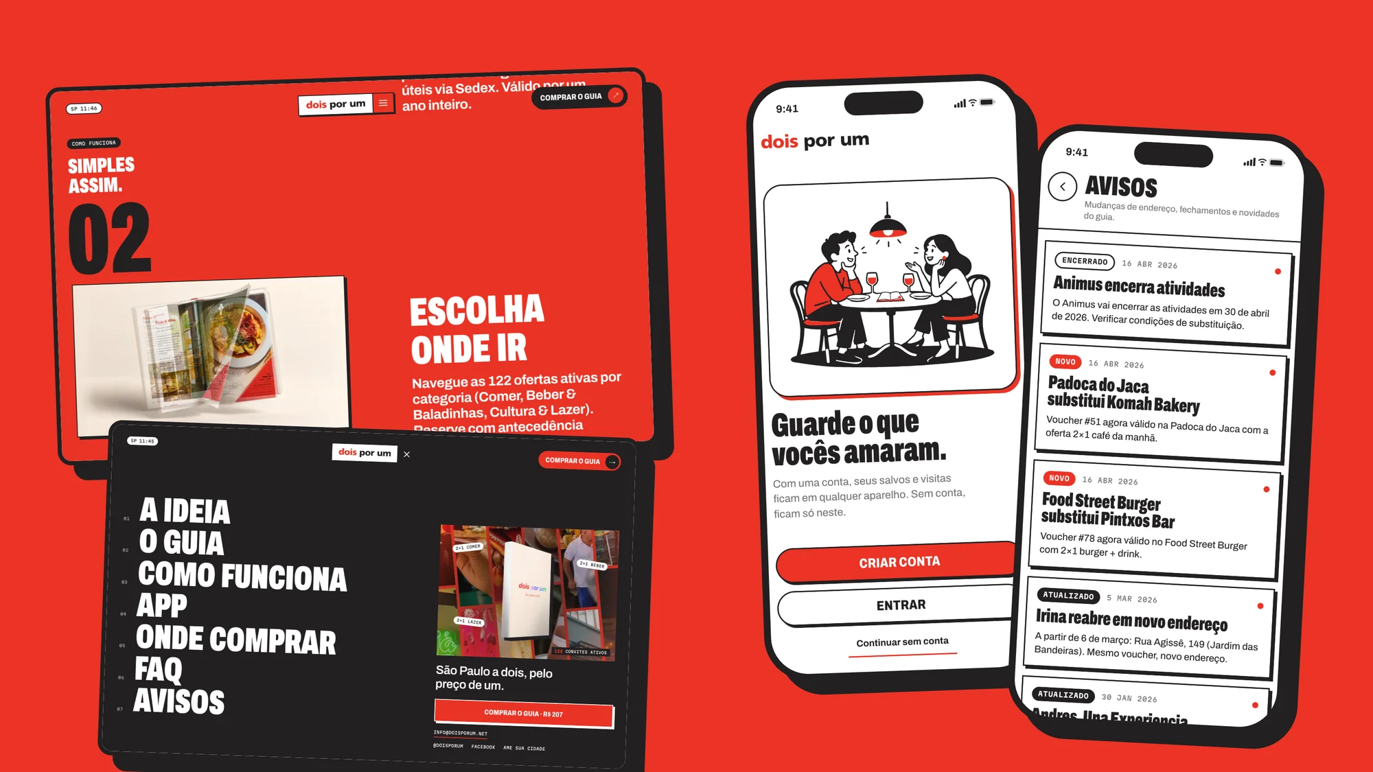
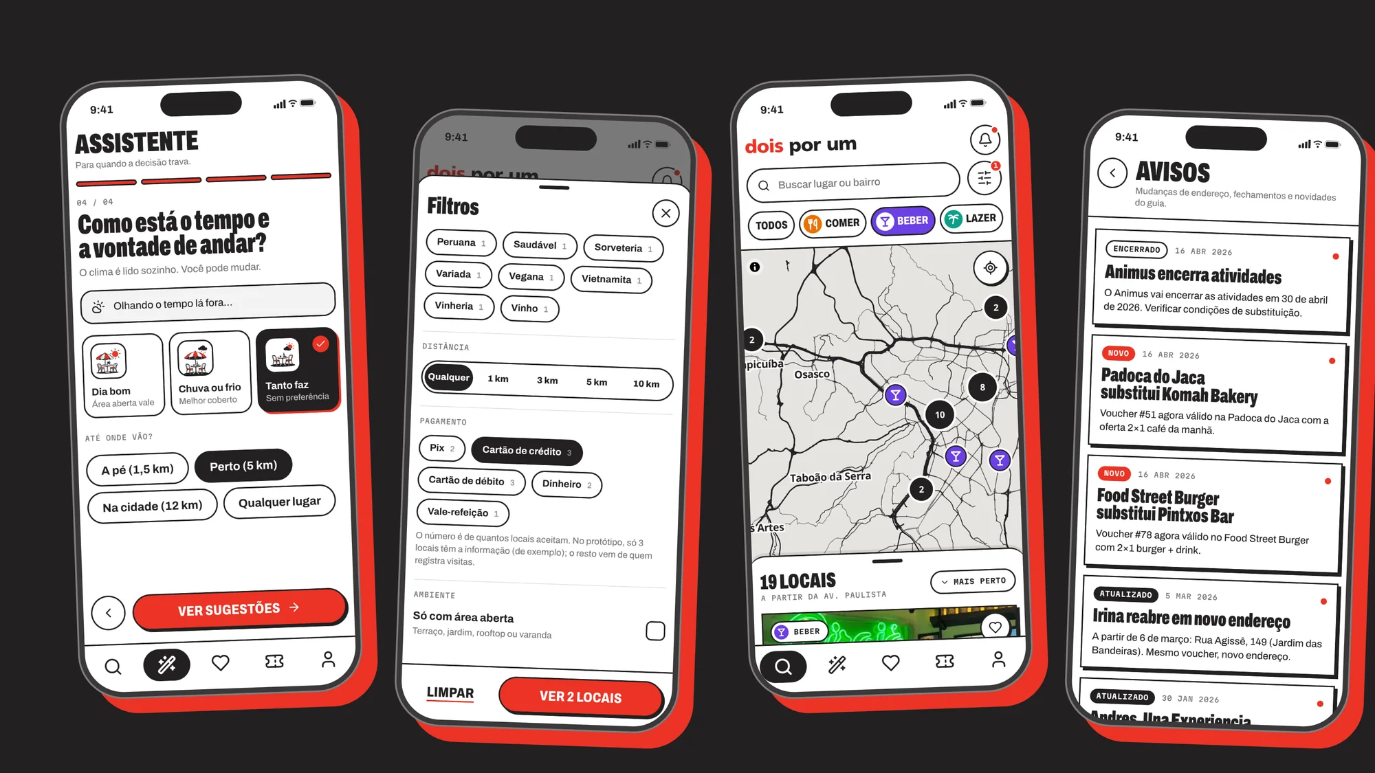
The current app had template leftovers and four font families. I set three colors (red, black and white), Archivo and Martian Mono, thick outlines and hard shadows, and drew the wordmark as a vector. Three category colors are the only exception, kept for the map.
Decision 3
Map first, list second
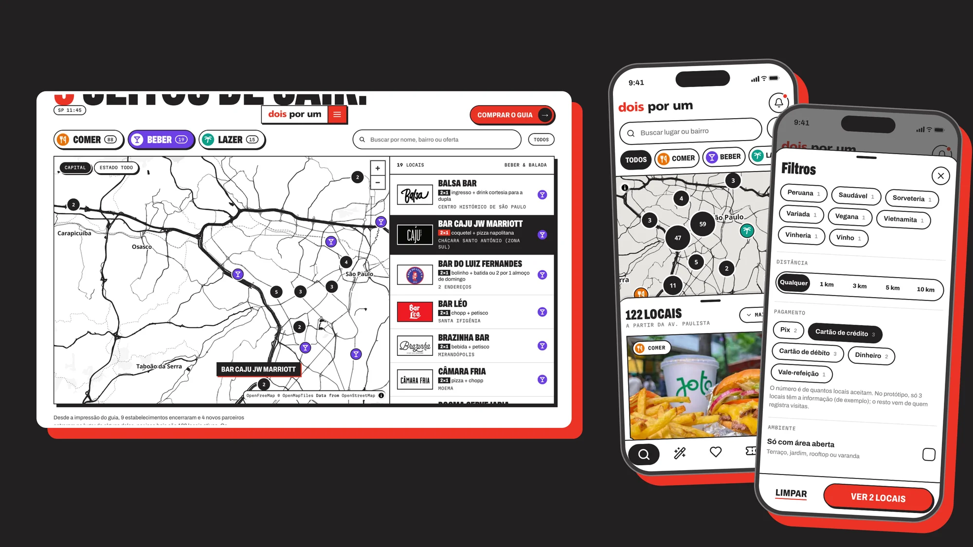
In Duo Gourmet you cannot filter with the map open. In the redesign, exploring and saving are one screen: a full-screen map and a draggable drawer of cards, and filtering moves the pins at the same time. The filter button shows how many places are left. Twelve of the 23 written App Store reviews asked for better filters.
Decision 4
Savings are informed by the person, never invented
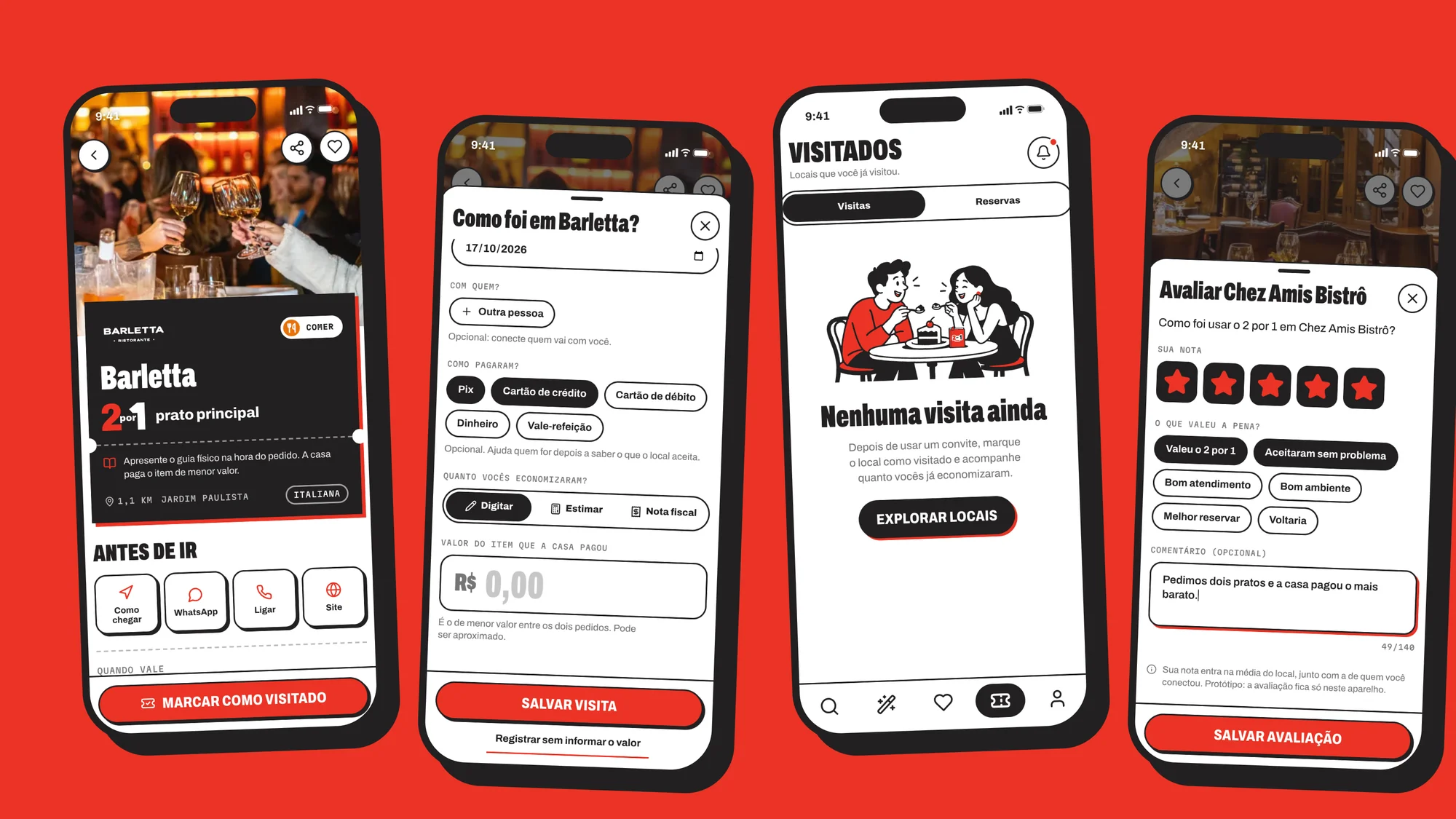
One participant found the savings feature only months after installing, and the guide gives no value in reais. So the person types the value, picks an estimated one or attaches the receipt, and the Visited screen shows how far the guide is from paying for itself (R$ 207).
Decision 5
An assistant for when the decision stalls
The survey’s main motivator was discovering new places, and the current app only had an “I’m feeling lucky” button. The wand tab asks about the moment, the occasion, what the group will NOT eat and the weather, and suggests three places with reasons.
Decision 6
Be honest about what is simulated
There is no real data for menus, payment, reviews or photos, so all of it is a sample or comes from the people who use the app, and every screen says which. Booking confirmation and connected people are simulated, and the QR voucher is a proposal.
Solution
One site, one map and one app, all pointing back to the book
A home page that sells the book and explains how it works, a map of every offer and a free app that keeps the guide up to date. None hides that the book is needed.
Solution 1
An immersive home page
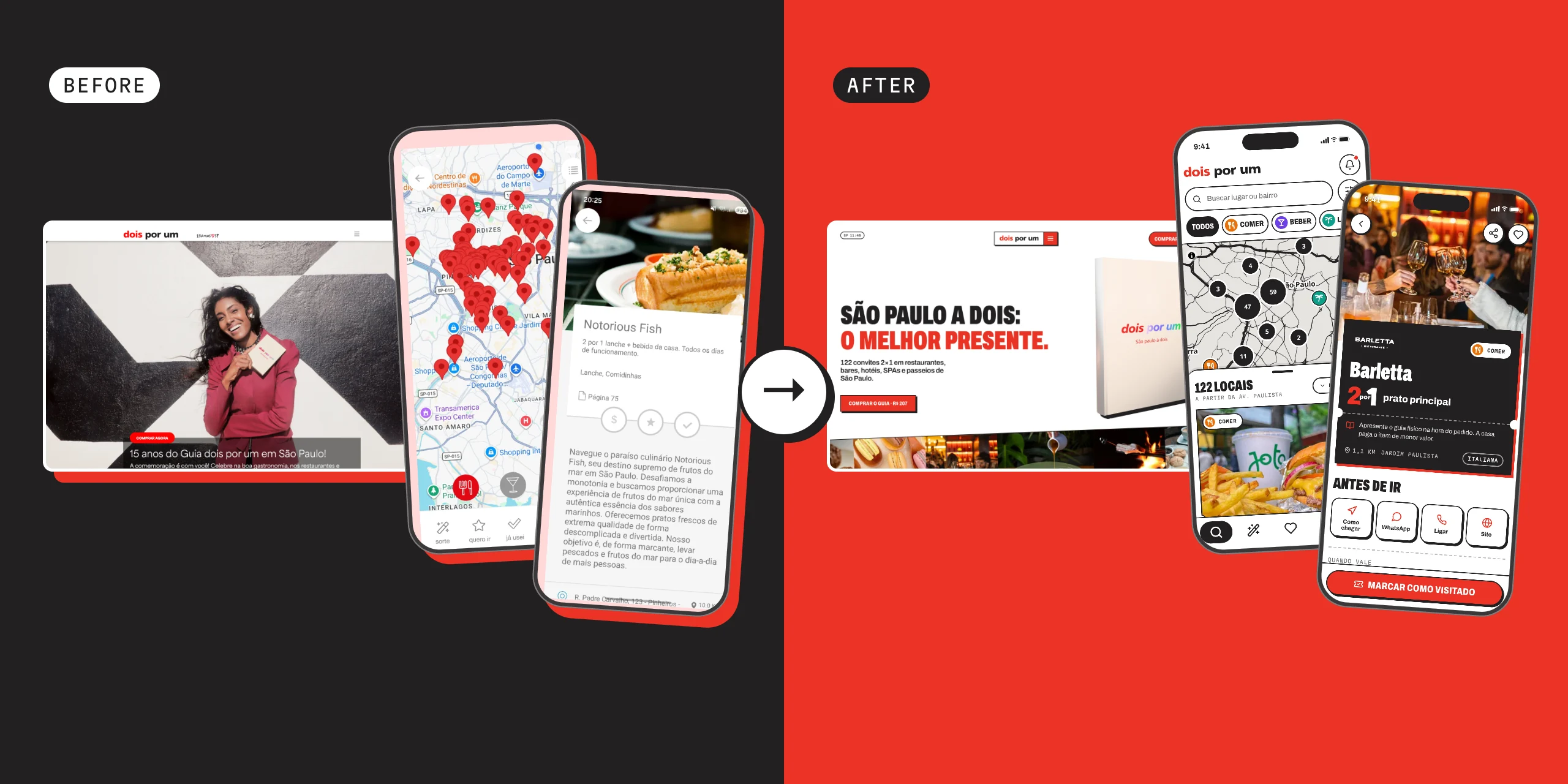
A calm, scroll-driven page in three colors: the book, the idea, how it works in three steps, the app, where to buy and the questions people ask. On a phone the main content shows in 1.7 s, against 11.1 s on the current site, and the home page weighs 0.5 MB, against 12 MB.
Solution 2
A map of all 122 offers
Every place on a map with category pins, a list that follows it, search and filters. A place opens as a notebook-style spread, with the photo on the left and the offer on the right. The 9 closed places stay at the end of the list, greyed, with their replacements.
Solution 3
A free companion app
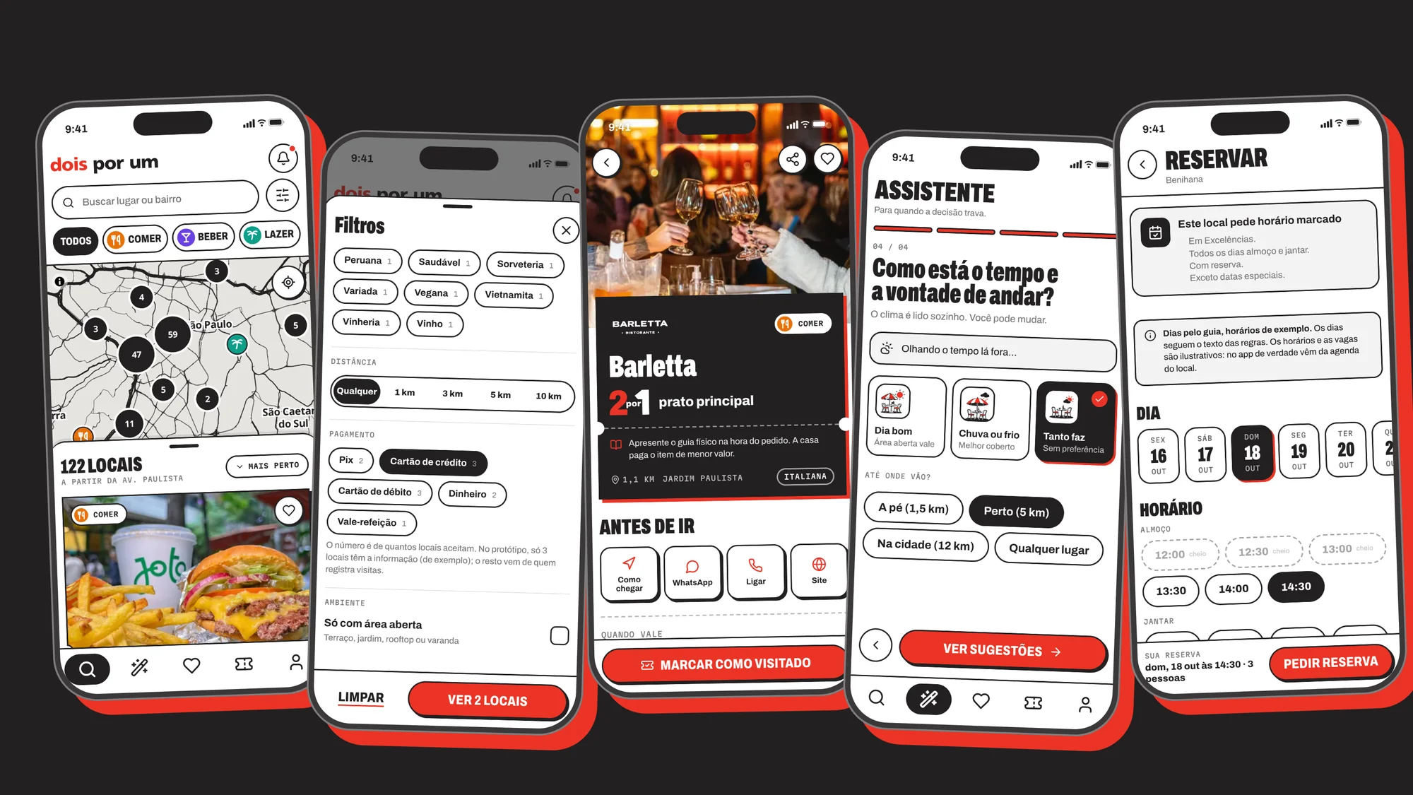
A free prototype with the explorer, saved places, the place page, visits with savings, an assistant, notices of changes and a profile with connections. It runs inside the site’s phone, where a finger uses it on its own to show each feature.
The app in use
The seven features, each used by a finger
The app runs inside the site. These are the scripts the finger performs, recorded from the prototype.
Filters that say how many places are left
Category, cuisine, distance, open-air and payment method, with the number of places left shown live. The most repeated request in the reviews and in the interviews.
The map and the drawer move together
Filtering changes the pins at the same time, and tapping a card opens the place. A Play Store review complained about getting from the list to the map.
Save with the heart
Every card has a heart, and the Saved tab gathers what the person kept, on the map and in a list.
Connect another person and agree where to go
A code that shows only in each person’s app connects two people, who see each other’s saved places and what they have in common. Simulated in the prototype. Six App Store reviews asked for this.
A menu that counts the 2-for-1
Marking dishes shows how much the house pays. The three menus are examples, labeled as such.
Booking in a few taps
Day, time and number of people. The times are examples and the confirmation is simulated, and the screen says so.
Notices of changes behind the bell
Changes of address, closures and news, with a tag, a date and a dot on the unread ones. Among the three apps read, only Dois por um has this.
Try it
Use the app and visit the site
The prototype works for real, on a phone or a computer. Saves and visits stay in your browser; payments, ratings, photos and menus are examples.
- Open the prototype
dois-por-um-guia.vercel.app/prototipo?app
- Visit the website
dois-por-um-guia.vercel.app
Evaluation
Measuring and reading: what changed from the current to the new
I used AI to compare the two sites and the two apps, keeping what a tool measures apart from what the AI reads.
Sites · measured
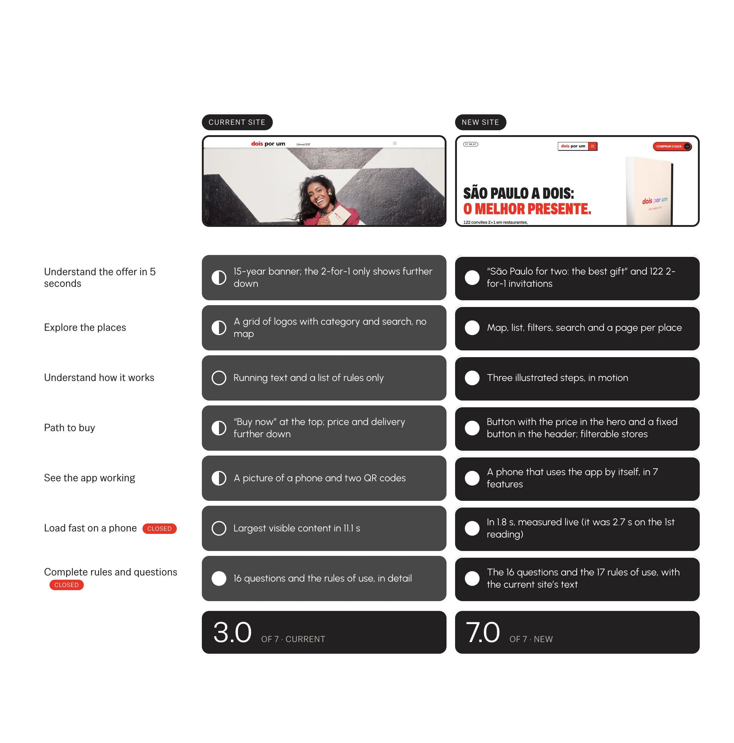
The new site shows its content 6× faster on a phone
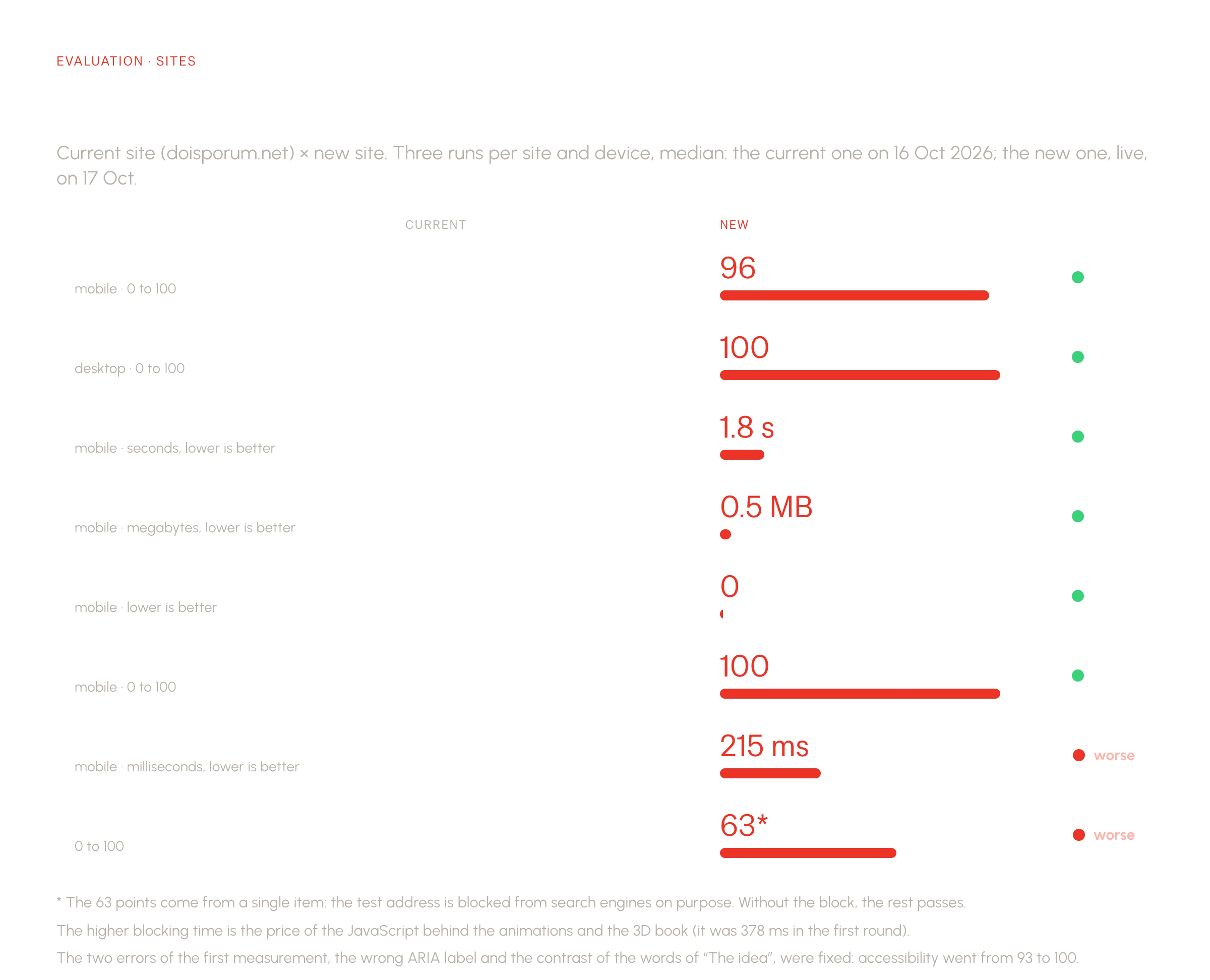
Lighthouse, three runs per site, median. The largest visible content shows in 1.7 s, against 11.1 s on the current site. Not everything improved: blocking time rose from 0 to 246 ms, the price of the animations and the 3D book. The tool also found two real accessibility errors, which I fixed (93 to 100).
Sites · read by AI
Seven criteria, and the new site meets all seven
For what a tool does not measure, the AI read both sites against seven criteria, with the evidence beside each score. The first reading gave the new site 6 of 7: it lost on loading speed and on complete rules and questions. I closed both and read again: 7 of 7, against 3 for the current site. Claude read and also built the site, so the bias favors the new one, which is why every score carries its evidence.
Apps · needs
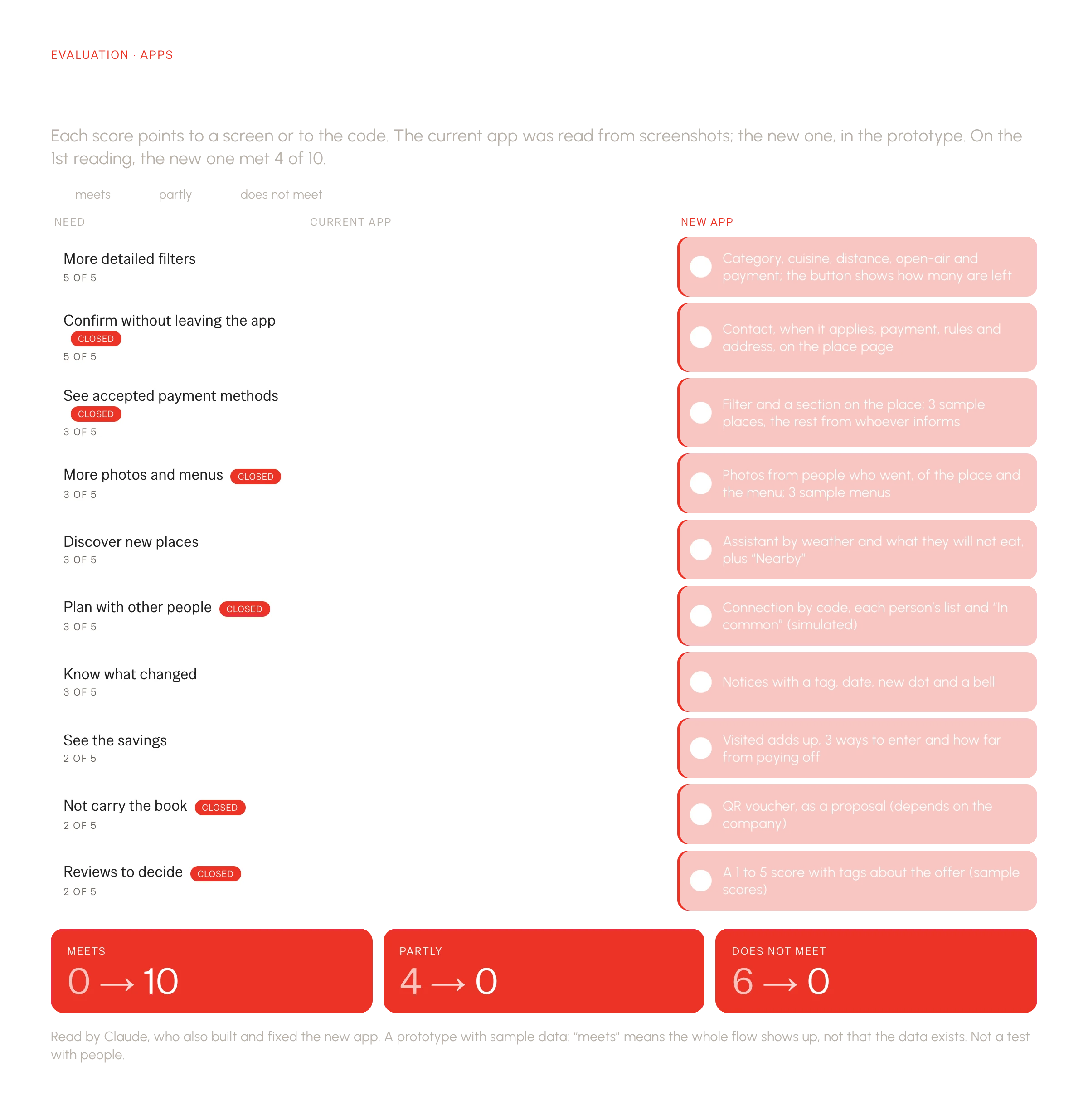
Of the 10 needs from the interviews, the new app meets all 10
Each need became a row, scored with the screen or the code as evidence. The current app meets none in full. The new one met 4 at first; I closed the rest in the prototype (payment methods, reviews, not carrying the book) and read again. Meeting means the flow is shown, not that the data exists: it is sample data, and the QR voucher is a proposal.
How it was done
What was measured, what was read and what is missing
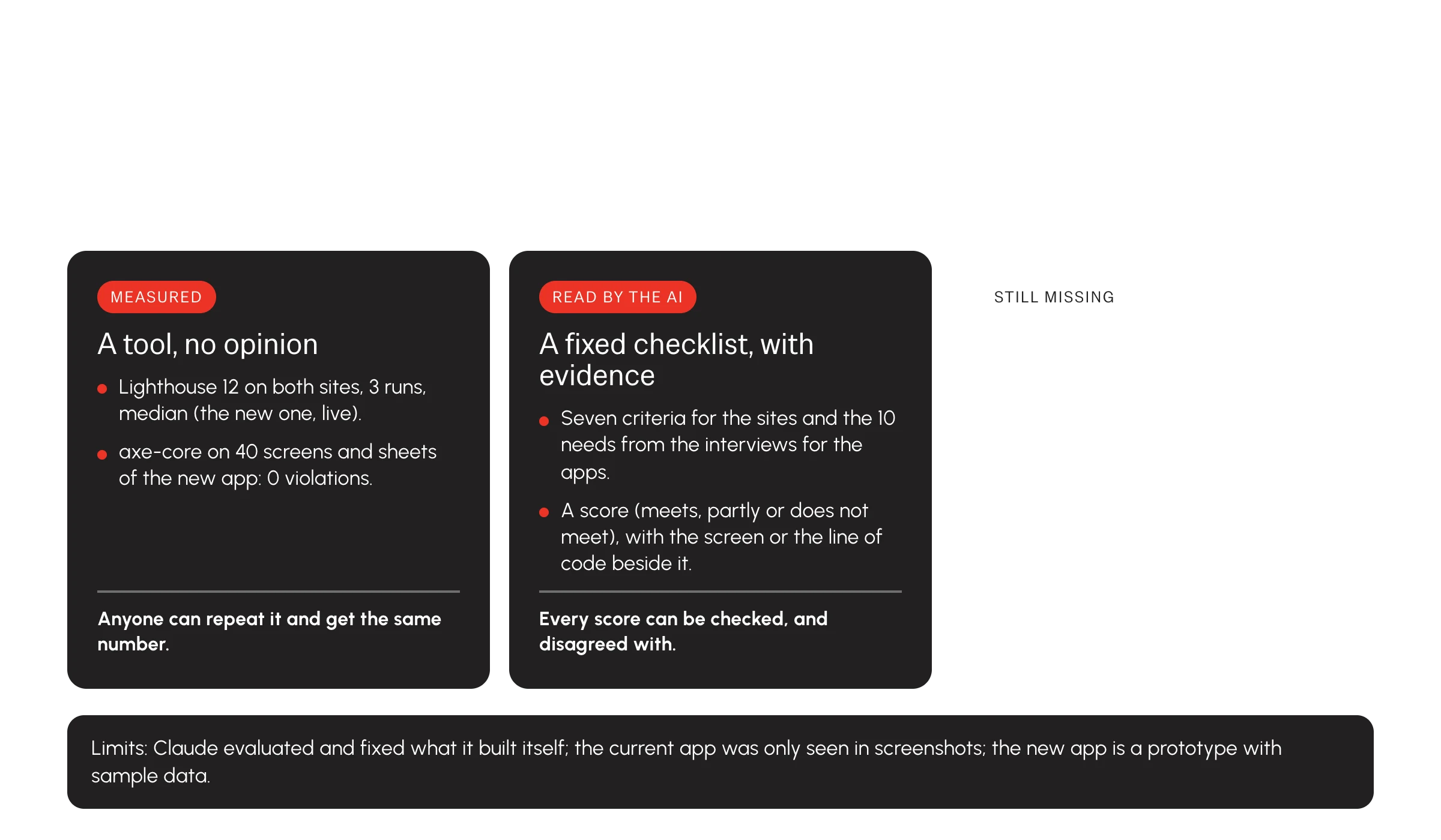
Measured is what a tool repeats (Lighthouse, axe-core). Read is what the AI scored against a fixed checklist. Still missing: a usability test with five people and usage data. A second blind reading by another AI would reduce the bias.
Results
A complete prototype, with honest numbers
These are deliverables, measurements and AI readings, not business results: the site and the app are not in production and there is no test with people yet.
6×
faster to show the content on a phone (measured)
The largest visible content shows in 1.7 s on the new site, against 11.1 s on the current one, and the home page weighs 0.5 MB, against 12 MB.
Lighthouse 12, three runs per site, median, simulating a phone: the new site live on 17 Oct 2026 (six runs, before and after style fixes, gave LCP from 1.4 to 1.8 s and blocking time from 208 to 350 ms) and the current one on 16 Oct. It got worse: blocking time (from 0 to 246 ms) and SEO (63, because the test address is blocked on purpose).
10 of 10
needs from the interviews met by the new app
The current app meets none in full. The new one meets all 10 in the prototype, with sample data and the QR voucher as a proposal.
An AI reading of the screens and the code, with the evidence for each score, after closing the gaps of the first reading (4 of 10). Claude also built and fixed the new app, so there is a bias. It does not replace testing with people.
0
accessibility violations found on 40 app screens and sheets
Checked with axe on the explorer, saved, visited, place, menu, booking, assistant, notices, profile and the main sheets.
axe-core run on each screen and sheet, at phone size in a headless browser (WCAG 2.2 AA and best-practice tags), without the study’s phone frame. It does not replace testing with people.
Reflection
The benchmark changed what I would design. I would have started by fixing what Dois por um does worse, and it showed that the advantage is in what only it has: the book. The most useful decision was a boundary: what the app may do (find, remember, warn) and what only the book does (redeem). I also learned to label what is invented and, when AI evaluates what the AI built, to say so and keep what is measured apart from what is read.
What I would improve next
- Test with people. A usability test with readers of the guide to check the map, the savings screen and the assistant, and a second blind reading by another AI.
- Decide the digital voucher with the company. The QR removes the hassle of carrying the book but contradicts today’s rule, and needs a server and the partners’ agreement.
- Swap the sample for real data. Payment methods, menus, photos and ratings coming from the partners and from the people who use the guide.
Other cases
All cases
Retail and gifts
Designing a personalization flow to reduce WhatsApp friction
A step-by-step flow that lets customers decide before they write, for a small gift business that sells through WhatsApp.

Market research
Building a connected system for research knowledge
A centralized intelligence layer that connects every study and insight into one conversational source of truth.